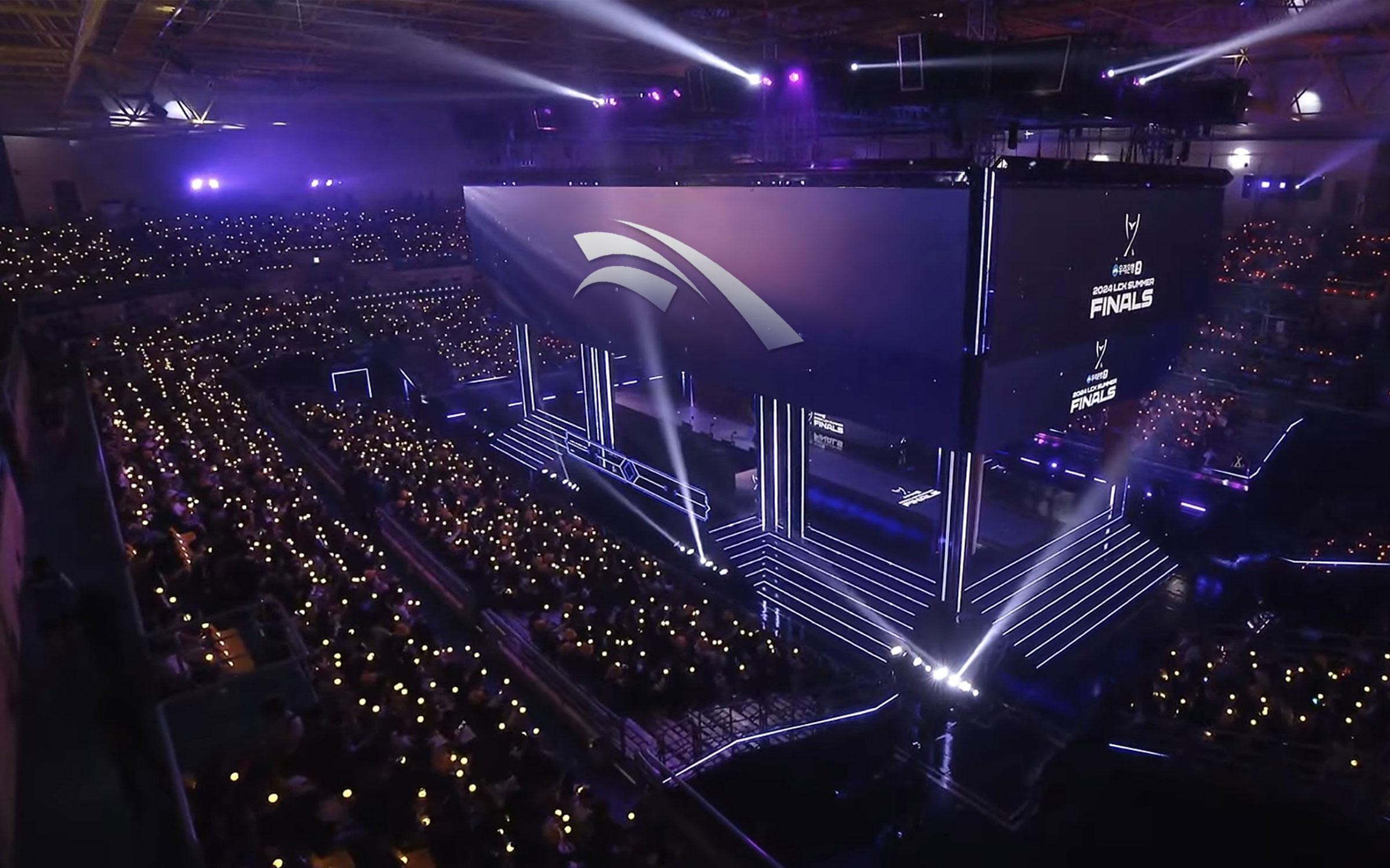
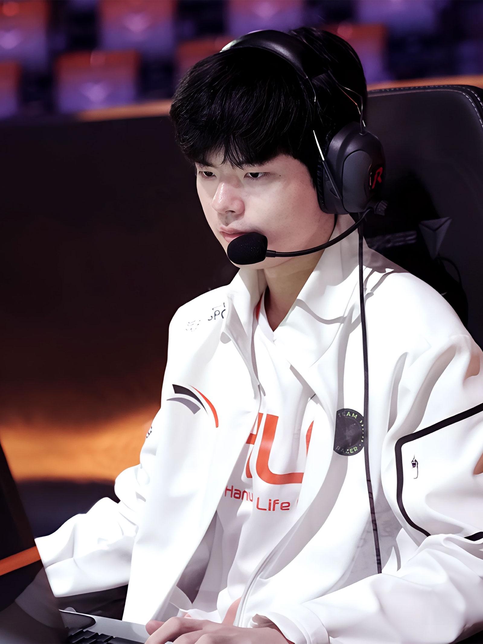
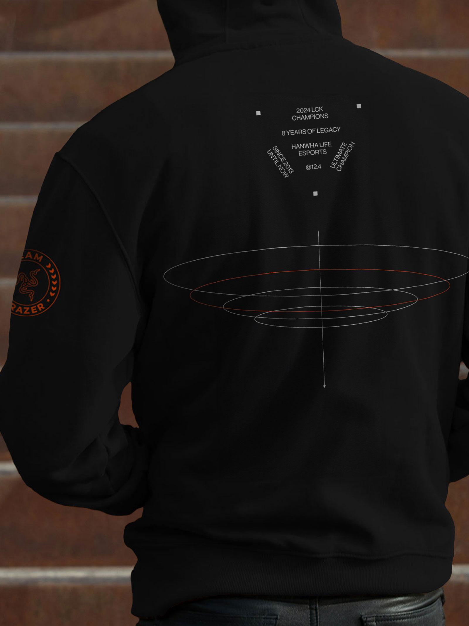
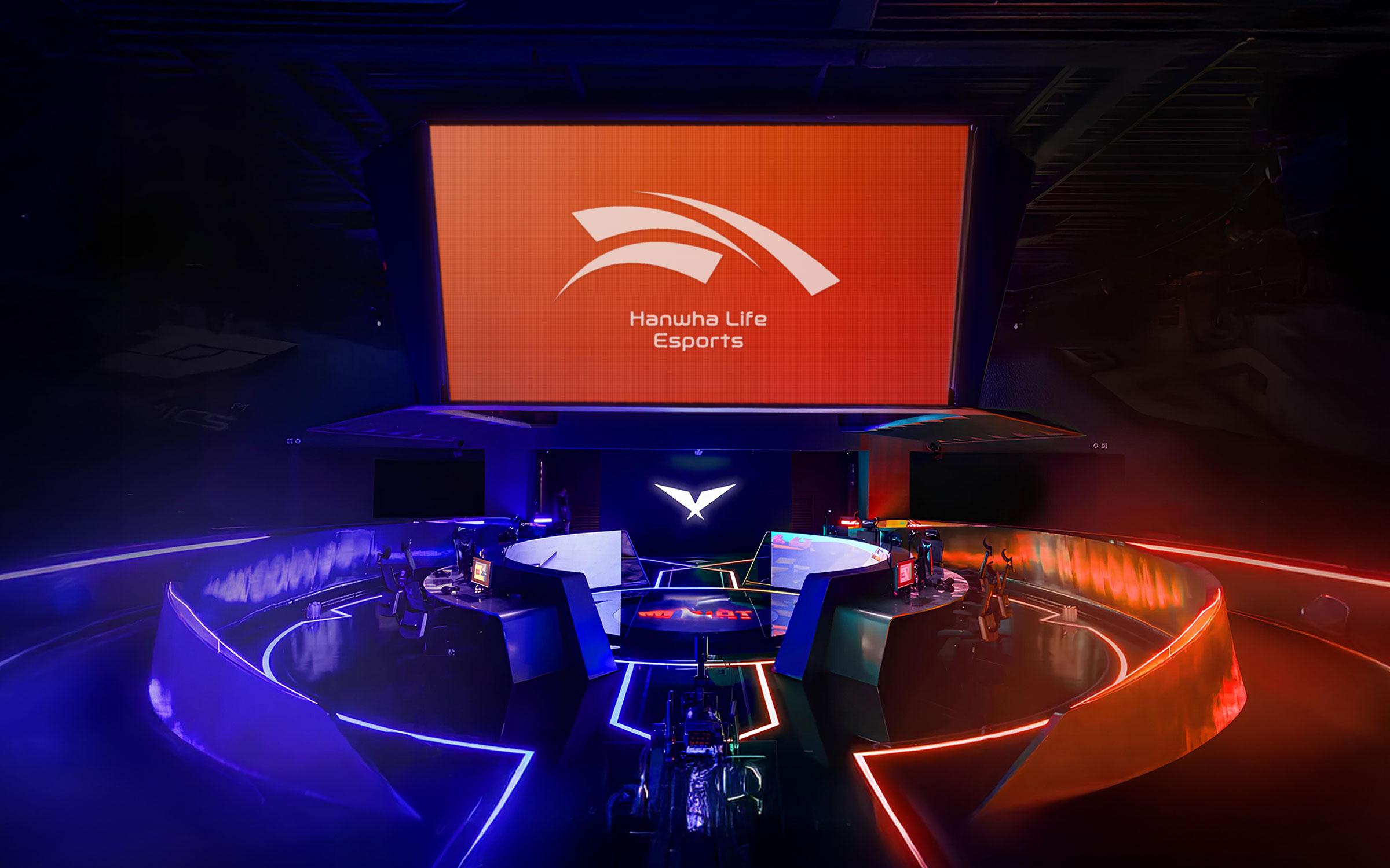
Hanwha Life Esports’ historic victory at the 2024 LCK Summer Split is the result of an eight-year journey of redefining the team’s identity and culture following its rebranding. The emblem, composed of harmonious orange curves and two shades of gray, symbolizes the core values that led to this achievement—trust, teamwork, and innovation. Grounded in strong mutual trust and collaboration, the team’s creative gameplay produced not only a well-earned championship, but also a deeply meaningful moment of unity.
