
Shaping a New Narrative
Journal May 16, 2025
The REJURAN brand identity renewal project was not merely about visual enhancement, but a journey to rediscover the brand’s core values and convey them consistently through visual language. In the rapidly growing skin booster market, REJURAN has quickly established itself as a trusted leader with its distinctive technology and credibility. This renewal was essential to solidify that growth and further refine the brand’s positioning. The core of this project was to align all stakeholders on what truly defines “REJURAN-ness,” establishing a unified understanding of the brand’s essence.
리쥬란 브랜드 아이덴티티 리뉴얼 프로젝트는 단순히 비주얼을 고도화하는 작업이 아닌, 리쥬란이라는 브랜드가 지닌 본질적인 가치를 재발견하고 이를 시각적으로 일관되게 전달하기 위한 여정이었습니다. 급성장한 스킨부스터 시장에서 리쥬란은 독보적인 기술력과 신뢰를 기반으로 빠르게 자리 잡았고, 이러한 성장세를 더욱 견고히 하기 위해 이번 리뉴얼이 필요했습니다. 리쥬란을 다루는 모든 이해관계자들이 브랜드의 정체성과 본질을 명확히 인지하고, ‘리쥬란스러움’이 무엇인지 함께 정의해 나가는 과정이 이번 프로젝트의 핵심이었습니다.
13.2.1
Pharmaresearch Architecture Analysis
13.2.1
Architecture proposal for branded houses
13.2.1
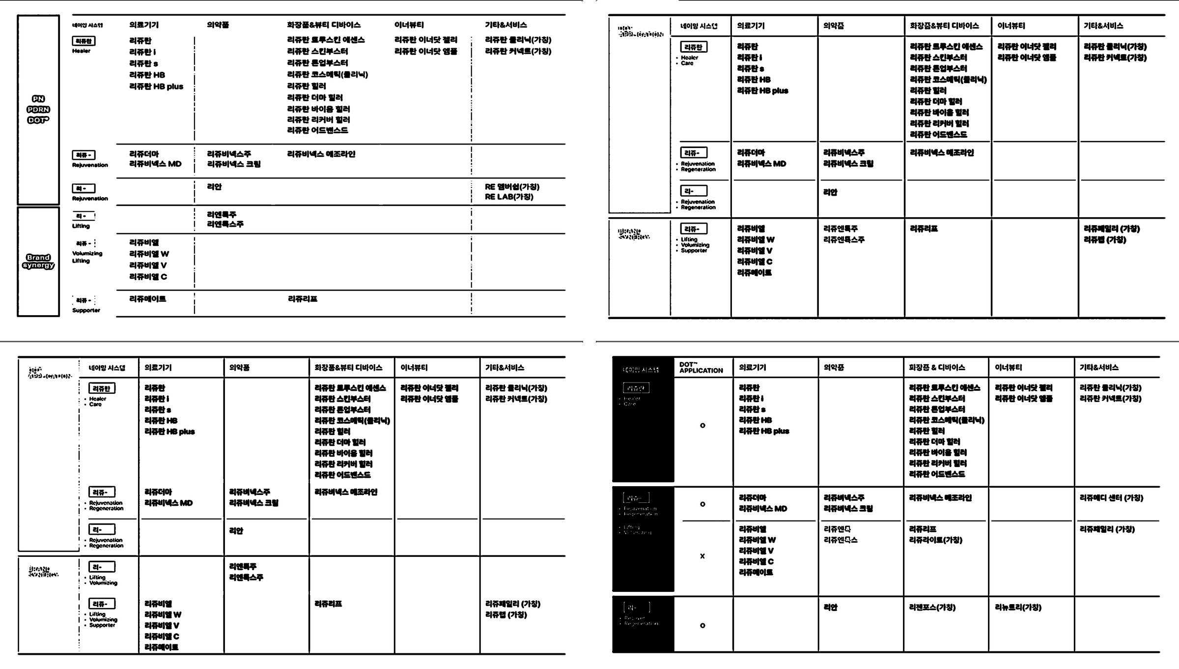
Refined naming system
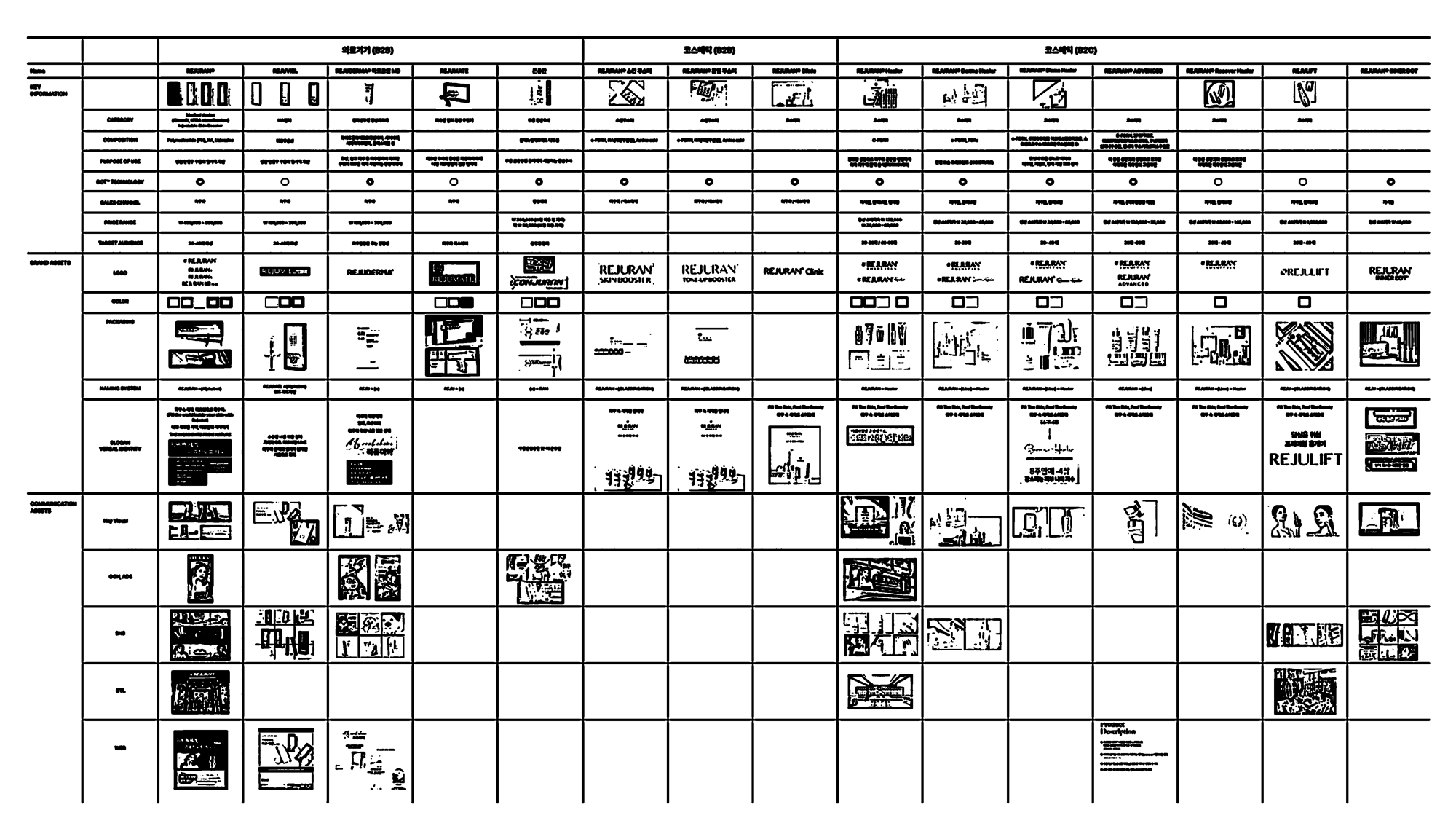
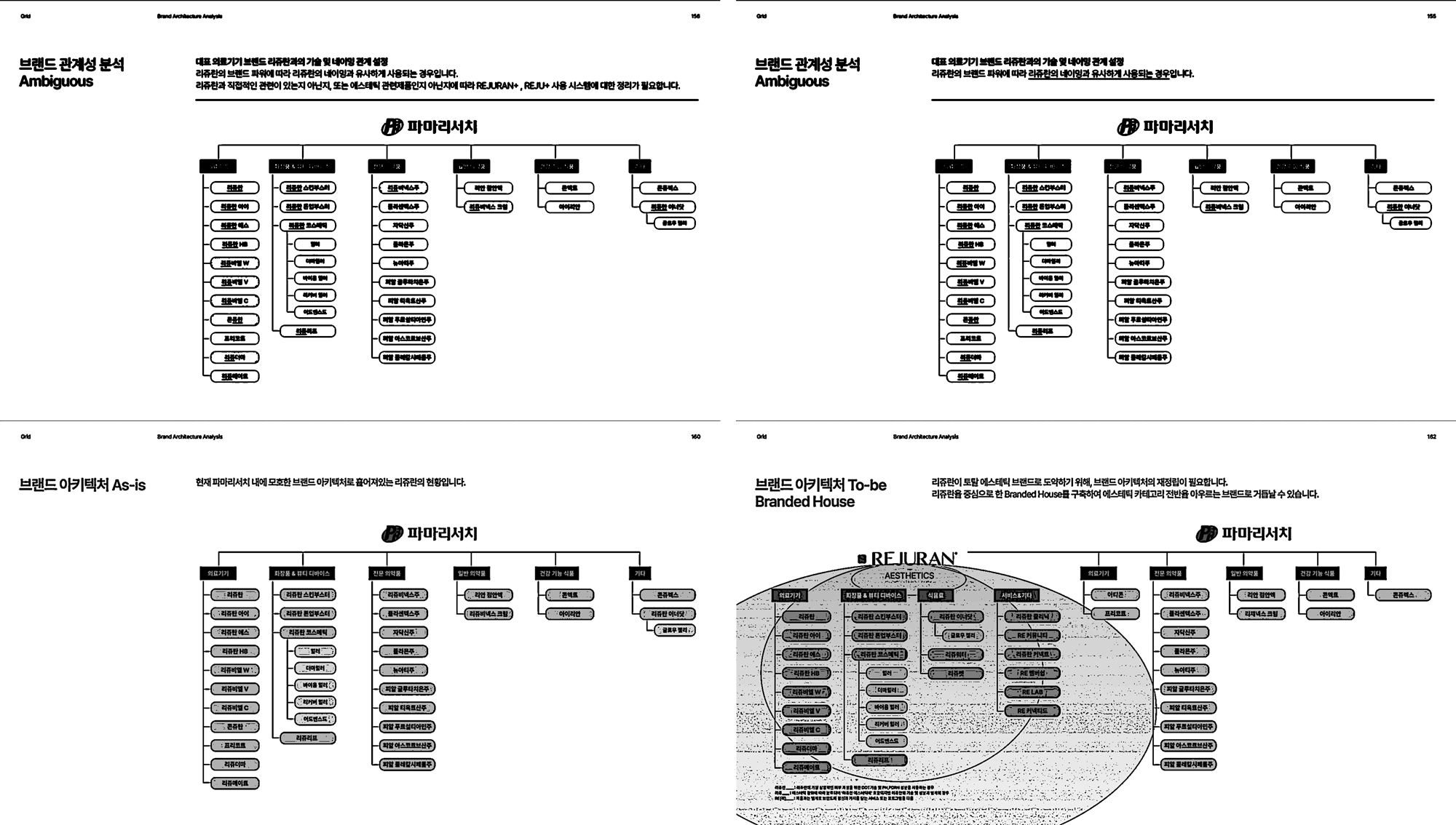
The REJURAN brand architecture was comprehensively restructured in this project. As REJURAN's presence within PharmaResearch has grown significantly, it became essential to further expand and systematize its existing image of healing and regeneration. To address this, we proposed the creation of 'REJURAN AESTHETICS,' a new structure designed to position the brand as a leader in aesthetics, extending beyond its original focus on healing and regeneration.
The renewed architecture centers around REJURAN’s core technologies, including the DOT™ technology and PDRN ingredient, reinforcing the brand’s fundamental message of 'regenerative energy' while strategically positioning it as a more prominent aesthetics brand in the global market. This approach not only redefines REJURAN’s aesthetic potential but also introduces a refined naming system to align with its expanded brand identity.
이번 프로젝트에서는 리쥬란의 브랜드 아키텍처를 전면적으로 재정비하는 과정이 포함되었습니다. 파마리서치 내에서 리쥬란이 차지하는 비중이 커진 만큼, 기존의 힐링과 재생이라는 이미지를 더욱 확장하고 체계화할 필요가 있었습니다. 이에 따라 우리는 '리쥬란 에스테틱'이라는 새로운 구조를 제안하였으며, 이는 단순한 재생과 힐링을 넘어 에스테틱 리더로서의 가능성을 명확히 드러내는 방향으로 설계되었습니다.
이번 아키텍처 리뉴얼은 리쥬란이 지닌 핵심 기술력인 DOT™과 PDRN 성분을 기반으로, 브랜드의 본질적인 메시지인 '재생의 에너지'를 유지하면서도, 글로벌 시장에서 에스테틱 브랜드로서 더욱 확고한 입지를 다질 수 있는 체계를 마련하는 데 중점을 두었습니다. 이를 통해 리쥬란은 힐링을 넘어선 에스테틱의 영역으로 확장하였으며 그에 따른 네이밍 시스템의 고도화를 제안하였습니다.
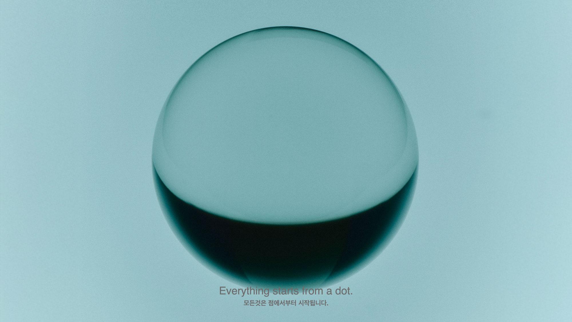
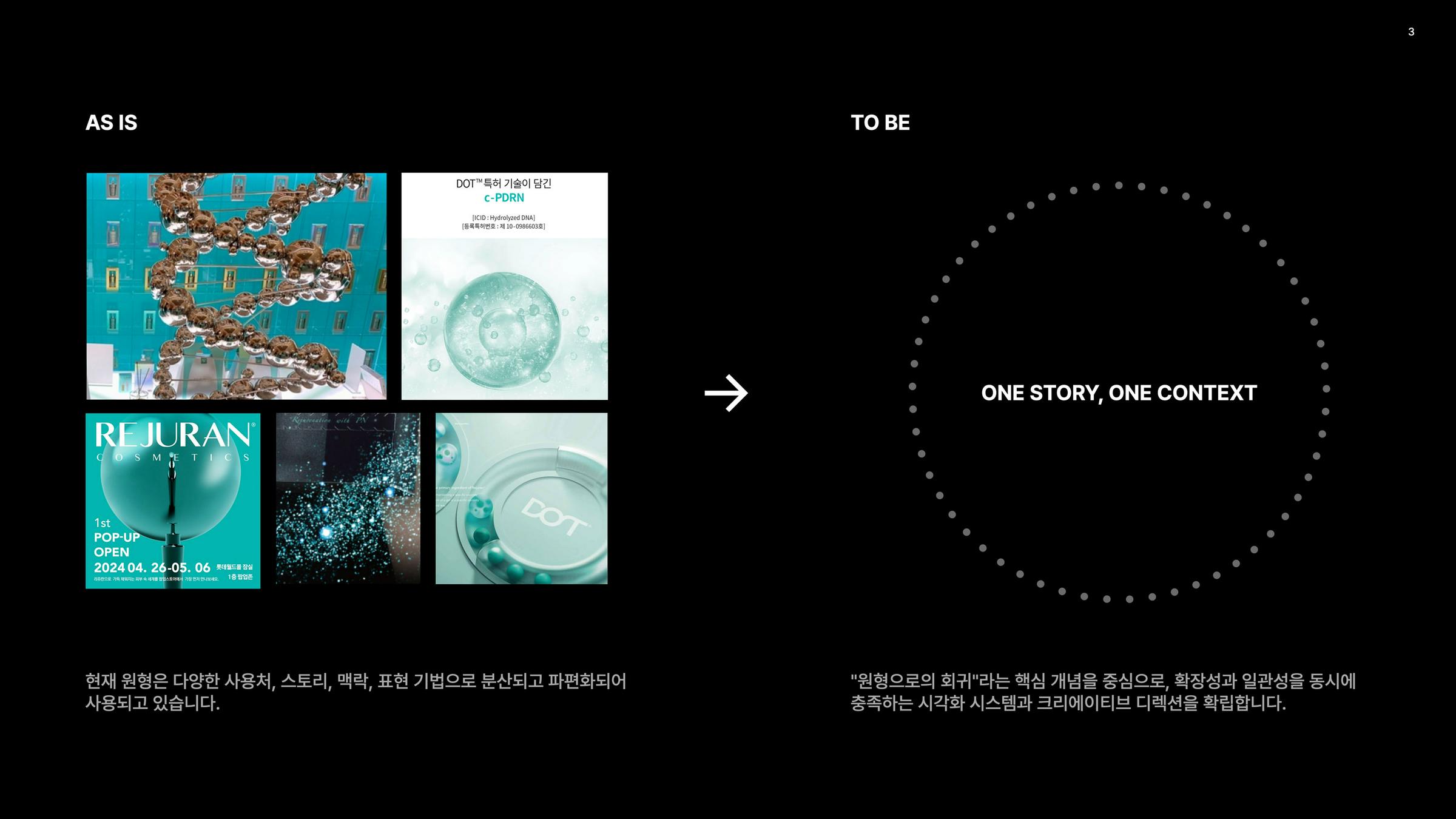
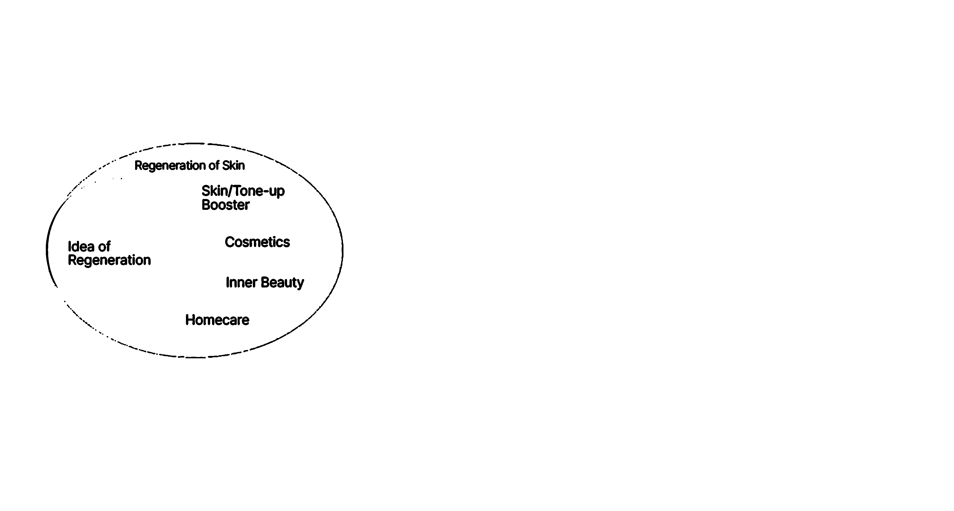
In the initial phase, REJURAN had established itself with a brand image centered around ‘regeneration’ and ‘healing.’ However, these messages were not clearly linked to the DOT™ technology. To address this, we redefined REJURAN’s brand platform, emphasizing the core message that “Everything begins from the DOT™.” This message not only symbolizes the brand’s commitment to healing and regeneration but also encapsulates its technological essence in a visually impactful way.
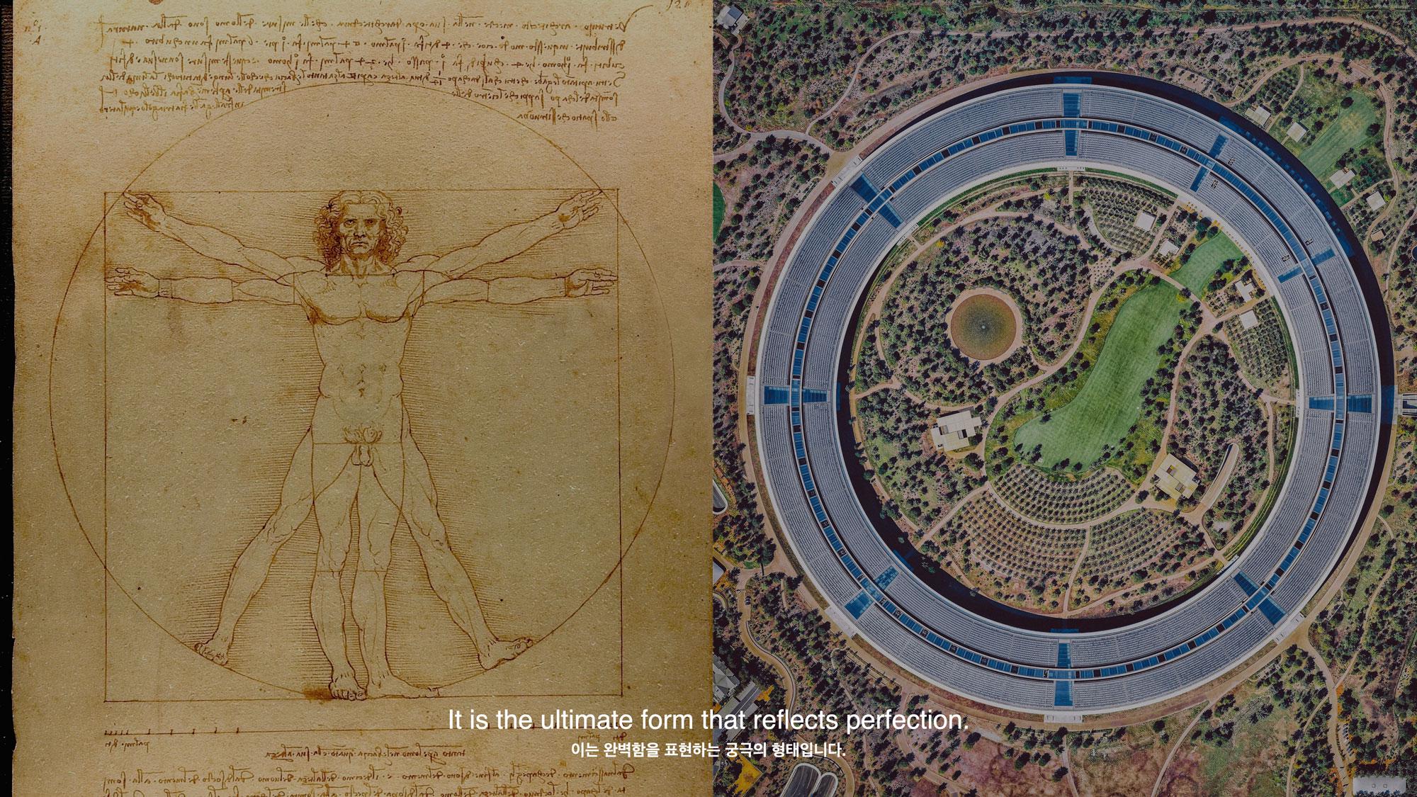
The concept of ‘Healer’ in REJURAN focuses on restoring the weakened inner energy to its original state, represented as the archetypal circle (Archetype). In this process, we emphasized that DOT™ is more than just a linguistic or visual symbol of a ‘dot’ — it is a technological concept that amplifies REJURAN’s regenerative power. By leveraging the dual meanings of the circle as both an archetype and a shape, we seamlessly connected the brand’s technological narrative with its visual and conceptual identity.
초기 단계에서 리쥬란은 ‘재생’과 ‘힐링’이라는 브랜드 이미지를 가지고 있었으나, 이러한 메시지가 DOT™ 기술력과 명확히 연결되지 못한 부분이 있었습니다. 이에 우리는 리쥬란의 브랜드 플랫폼을 재정비하며, ‘모든 것은 DOT™에서 시작된다’는 메시지를 통해 리쥬란이 전달하고자 하는 본질적인 가치를 더욱 선명하게 제시하였습니다.
이 메시지는 브랜드의 힐링과 재생을 상징하는 동시에, 브랜드가 가진 기술적 정체성을 시각적으로 함축해 전달하는 핵심 개념이 되었습니다. 리쥬란의 ‘힐러'의 개념은 피부속 내제되어있는 약한 에너지를 원형(Archetype)으로 복귀하는데 초점을 맞추었습니다. 이 과정에서 우리는 DOT™가 단순히 언어적으로 점(원형)이라는 형태적 의미를 넘어, 리쥬란이 추구하는 재생의 에너지를 극대화하는 기술적 개념임을 강조했습니다. 원형(Archetype)과 원형(Shape)이라는 이중적 의미를 활용하여, 리쥬란의 기술력과 재생의 서사가 시각적·개념적으로 자연스럽게 연결되도록 설계하였습니다.
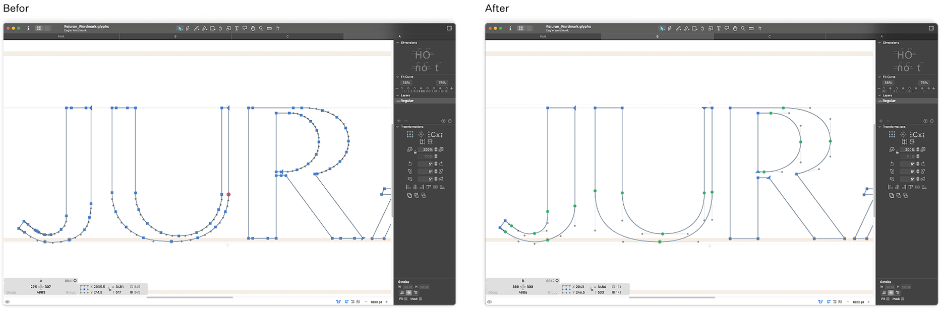
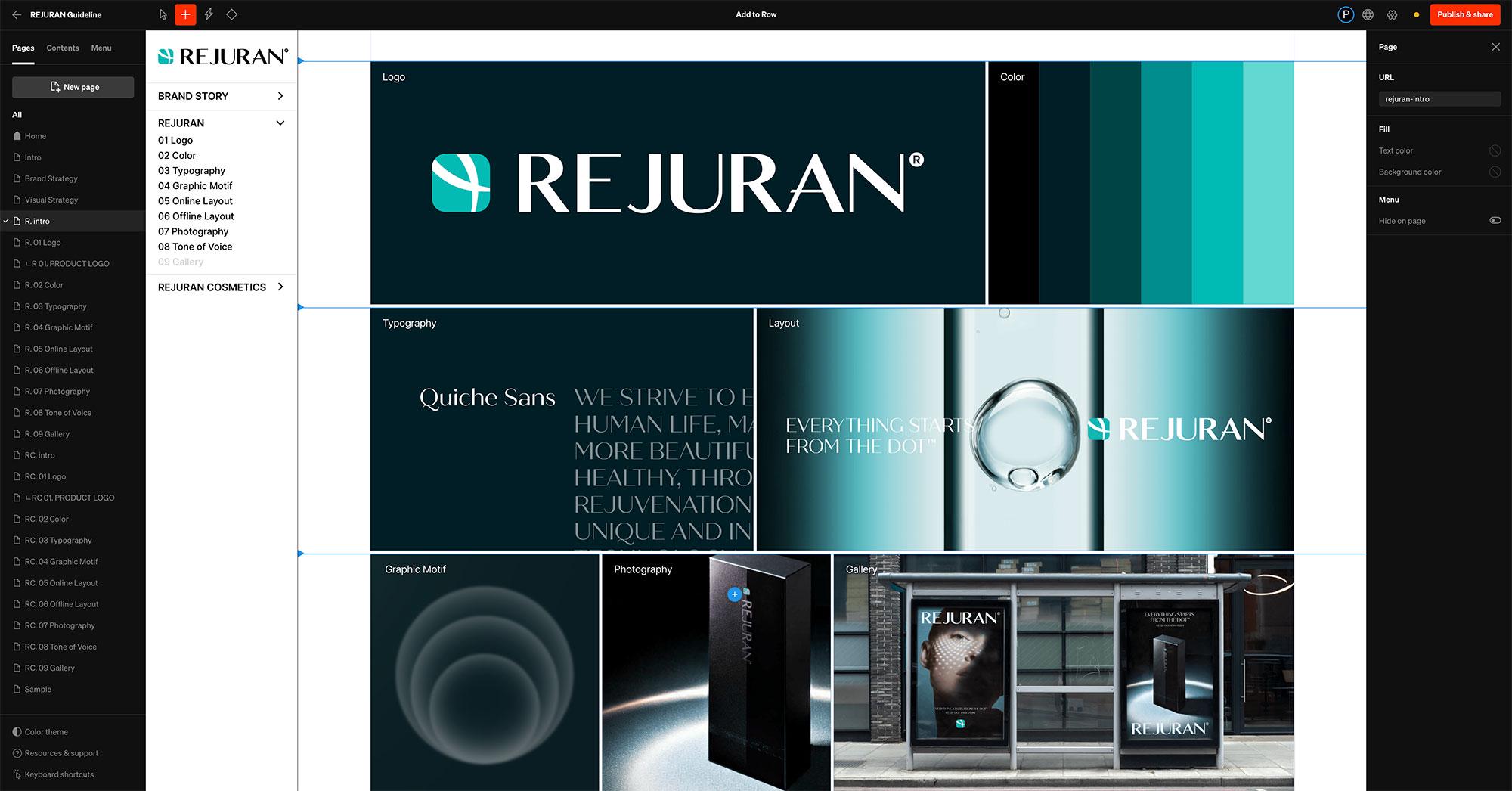
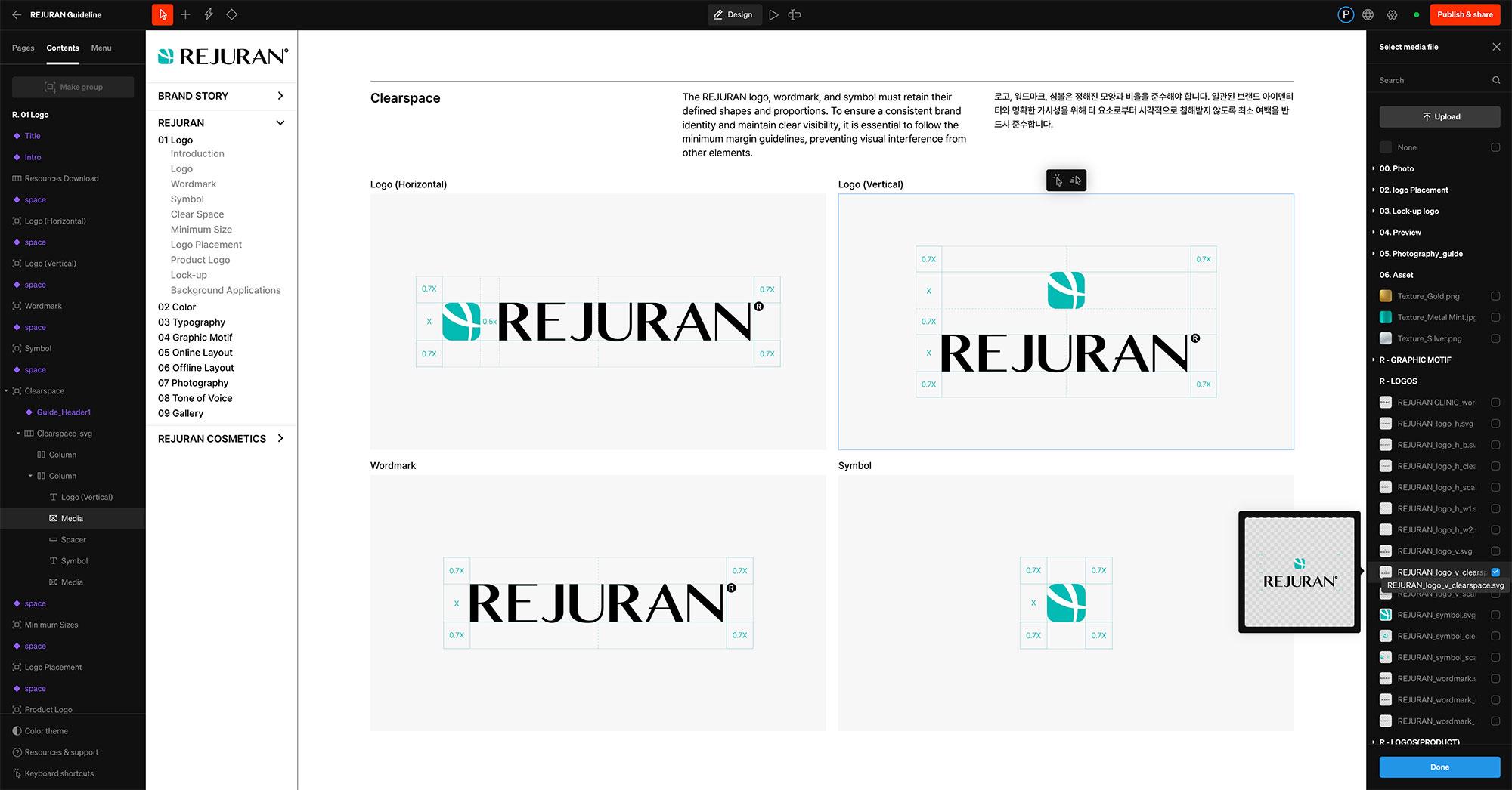
One of the most challenging aspects of the REJURAN brand architecture overhaul and visual refinement process was elevating the aesthetic sophistication of the existing logo and symbol without altering their original forms. Since the REJURAN logo had already established strong market recognition, we focused on enhancing its visual integrity without modifying its structure. Although the logo’s structure remained unchanged, we meticulously refined each node and curve in Glyphs to create a more polished and sophisticated impression. This approach not only reinforced REJURAN’s brand identity but also established a consistent logo guideline that ensures a cohesive brand perception across global markets.
리쥬란 브랜드 아키텍처의 재정비와 비주얼 고도화 과정에서 가장 도전적인 과제는 기존 로고와 심볼을 변형하지 않으면서도 이를 에스테틱 감각으로 일관성 있게 고급화하는 것이었습니다. 리쥬란 로고는 이미 시장에서 인지도가 형성된 만큼, 형태적 변형 없이 시각적 완성도를 높이는 방향으로 접근하였습니다. 로고의 구조적 변화는 없었지만, 글립스에서 각 노드와 곡선을 정교하게 다듬어 더욱 세련된 인상을 완성했습니다. 이를 통해 리쥬란의 정체성을 더욱 견고히 하면서도, 글로벌 시장에서 일관된 브랜드 인식을 구축할 수 있는 로고 규정이 확립되었습니다.
13.2.1
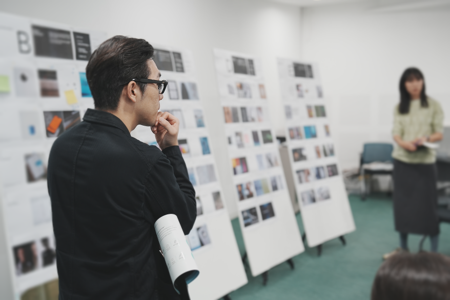
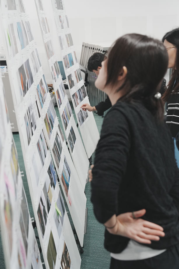
visual territory workshop
13.2.1
keyvisual shooting sketch
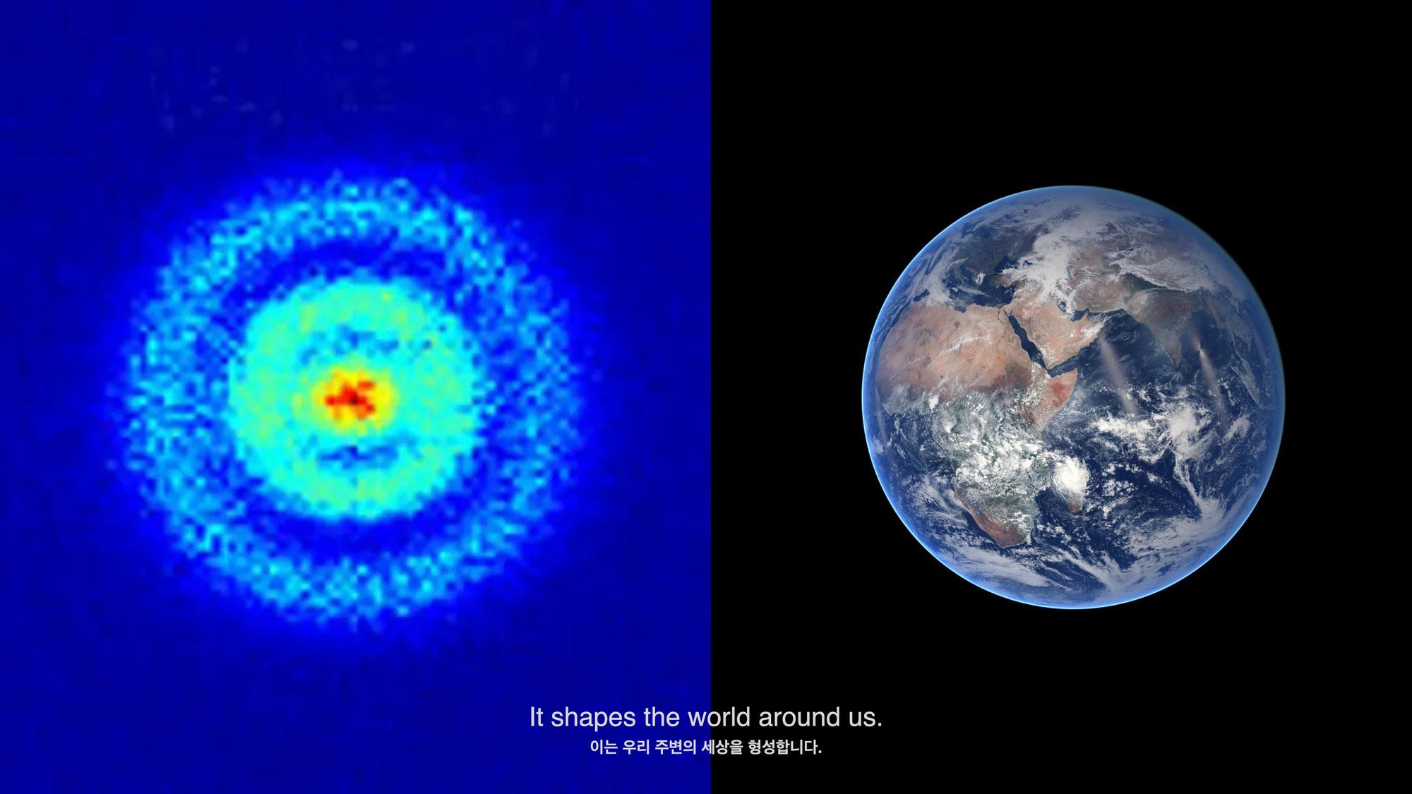
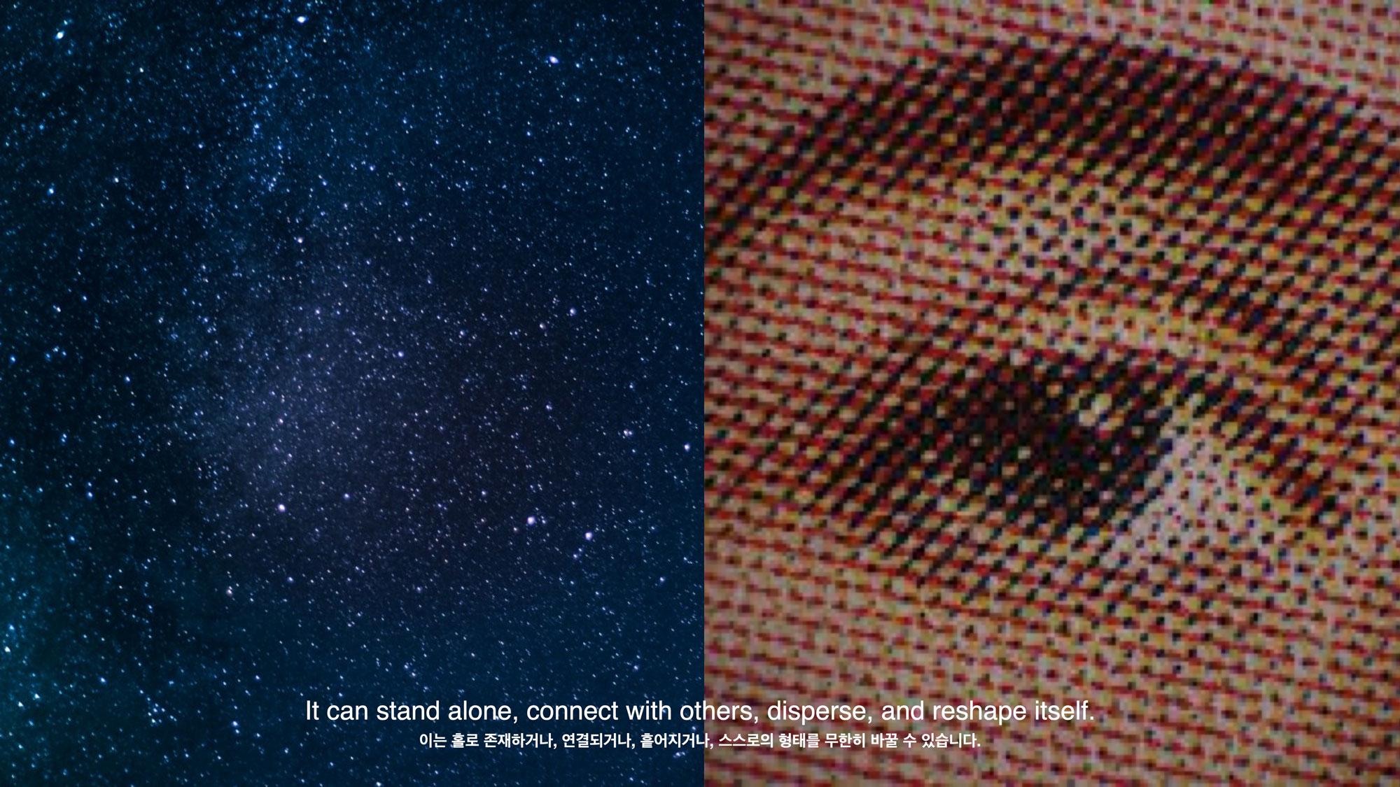
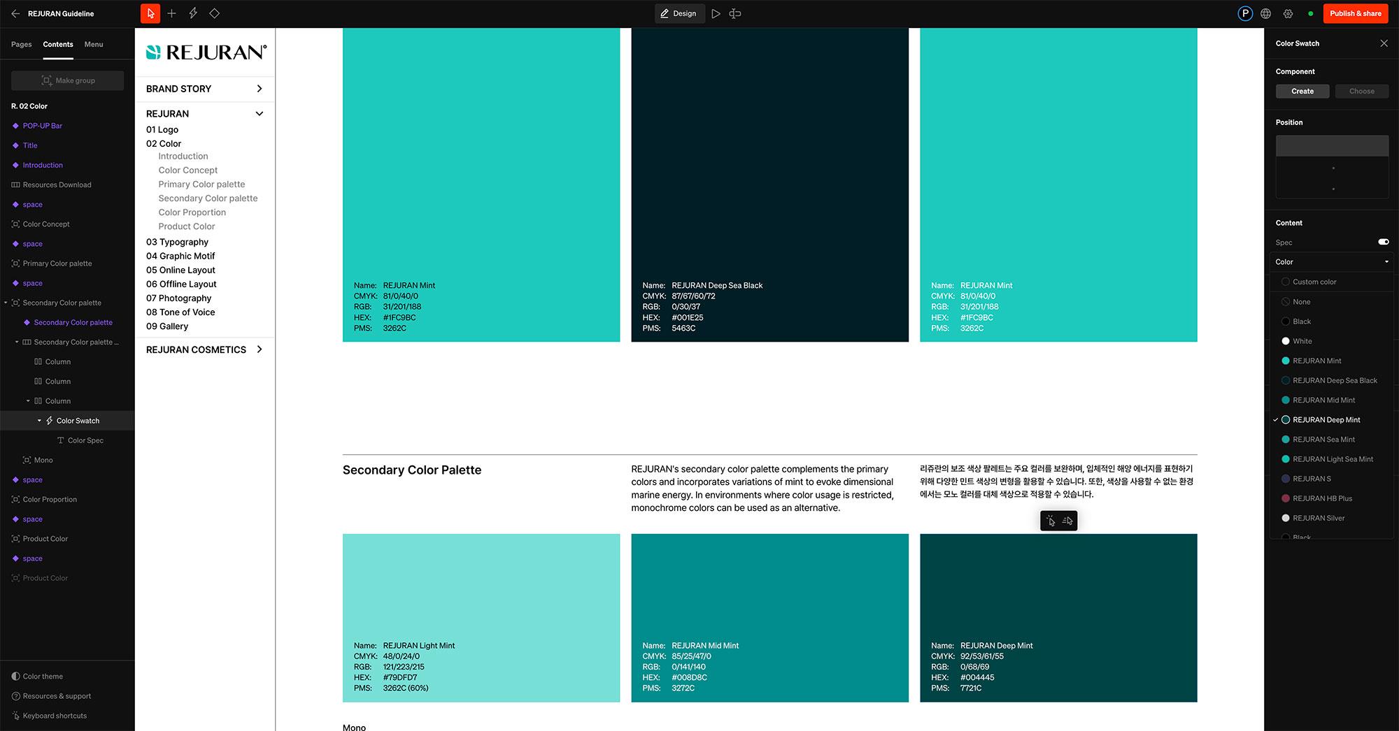
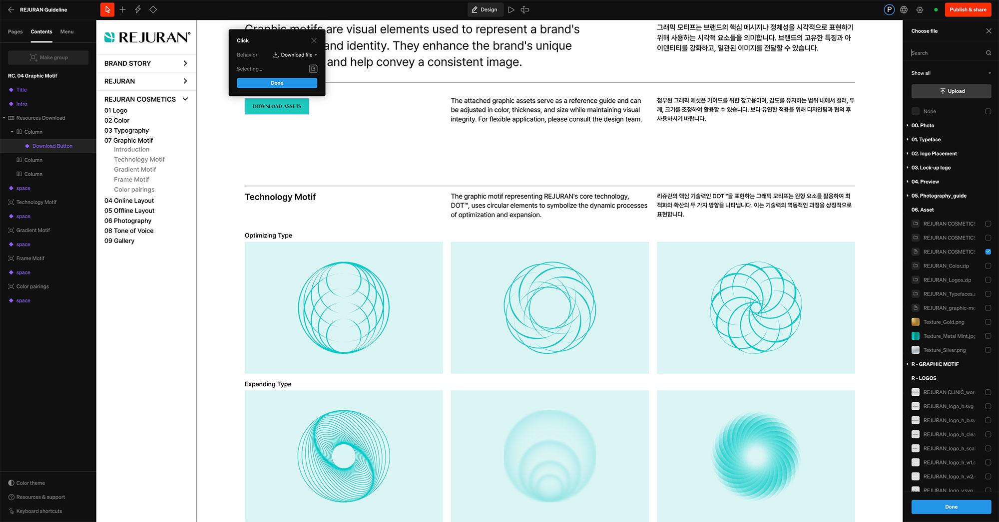
Additionally, REJURAN’s core identity elements, the mint color and particle imagery, were maintained while being more clearly aligned with a defined storyline. The mint color was reinterpreted to convey the essence of marine bio-energy, while the particle imagery was restructured to effectively communicate the narrative of regeneration and recovery. This was achieved by utilizing circular elements to visually represent both microscopic and macroscopic perspectives.
또한, 리쥬란의 핵심 아이덴티티인 민트 컬러와 파티클 이미지는 그대로 유지하되, 이를 보다 명확한 스토리라인과 연결시켰습니다. 민트 컬러는 해양 바이오 에너지의 근원적 감성을 담아내고, 파티클 이미지는 재생과 회복의 서사를 원형의 요소들을 통해 미시적·거시적 관점에서 효과적으로 전달할 수 있도록 재구성하였습니다.
13.2.0
Online Brand Guidelines Developed
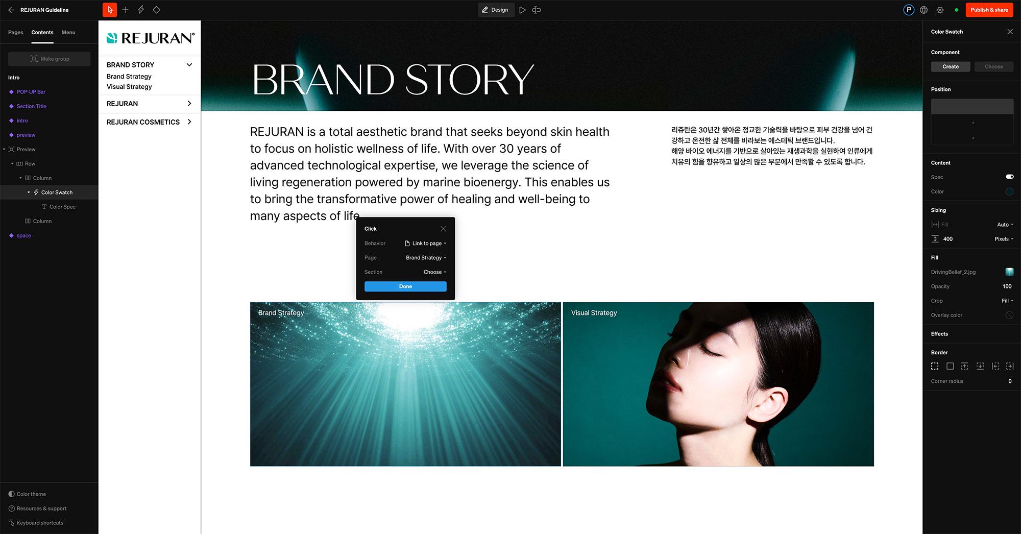
The final outcome of the REJURAN brand identity renewal is a live online guideline that goes beyond static PDF documents, embodying the brand’s vitality and refined sensibility. Reflecting REJURAN’s unique value of ‘regeneration,’ the platform is designed for seamless updates and flexible maintenance, ensuring consistent brand experiences across global markets.
Through this project, REJURAN has established a solid foundation to consistently communicate its core messages of "Regeneration" and "Healer" across global markets. The brand identity has become more defined through a cohesive visual language, providing a structured system for partners worldwide to effectively interpret and apply it. This initiative aims to position REJURAN as a stronger presence in the aesthetics market while setting the stage for further global expansion.
리쥬란 브랜드 아이덴티티 리뉴얼의 최종 결과물은 정적인 PDF 자료를 넘어, 브랜드의 생명력과 감도를 담아내는 라이브 온라인 가이드라인으로 완성되었습니다. REJURAN만의 ‘재생’ 가치를 반영하여, 언제든지 유연하게 업데이트되고 유지될 수 있도록 설계했으며, 글로벌 시장에서 브랜드가 일관성을 유지할 수 있도록 돕는 플랫폼으로 구축되었습니다.
이번 프로젝트를 통해 리쥬란은 브랜드의 본질적인 메시지인 ‘재생' 과 '힐러'를 글로벌 시장에서도 일관되게 전달할 수 있는 기반을 구축하였습니다. 일관된 시각적 언어를 통해 리쥬란의 아이덴티티는 더욱 명확해졌고, 각국의 파트너사들이 이를 효과적으로 해석하고 활용할 수 있는 체계를 마련하였습니다. 이는 리쥬란이 에스테틱 시장에서 더욱 견고한 입지를 다지고, 글로벌 확장을 위한 탄탄한 기반을 마련한 지점이 되고자 합니다.