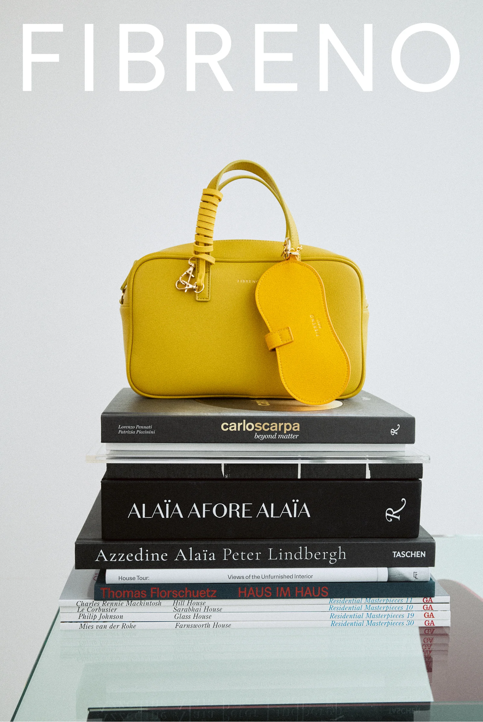
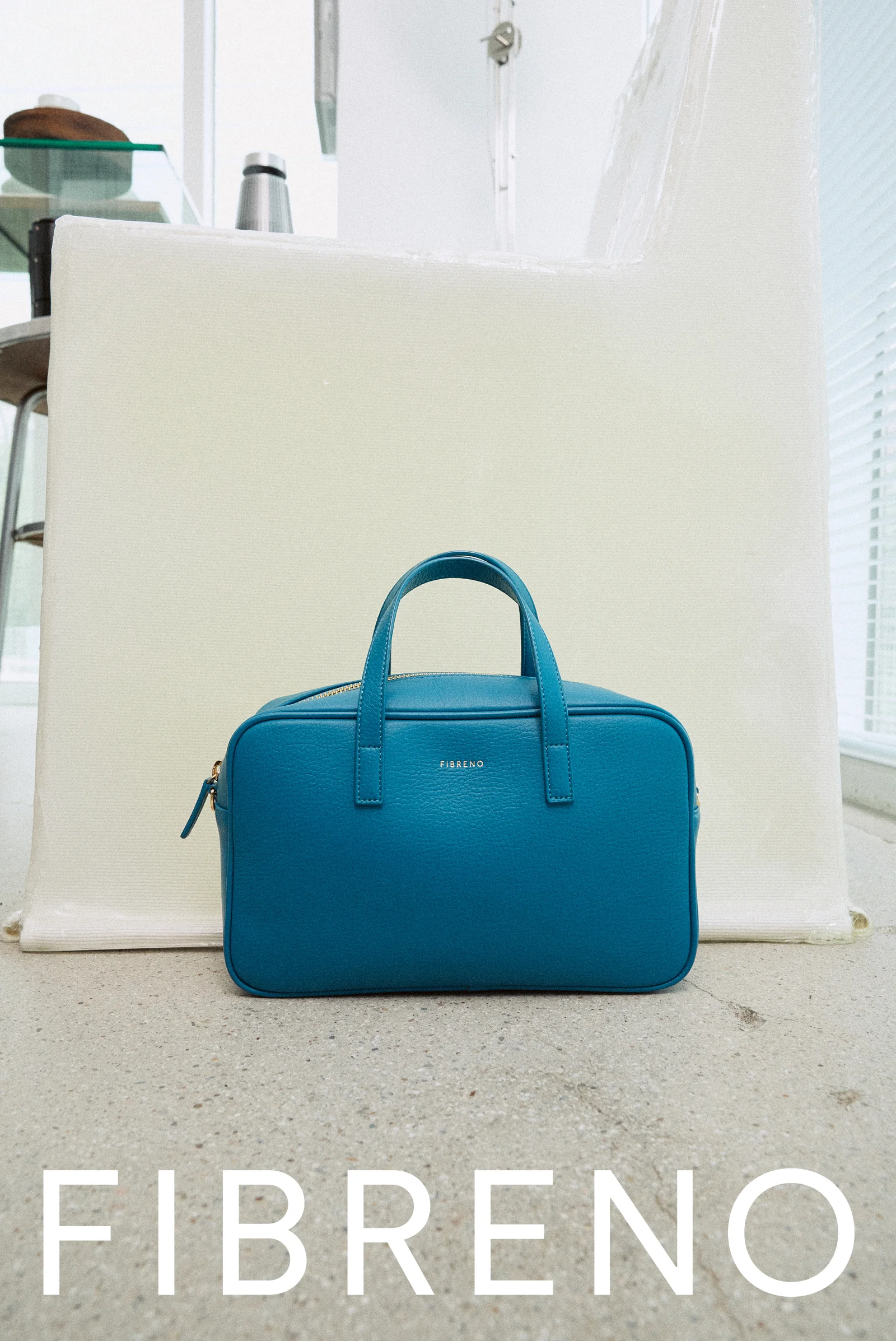
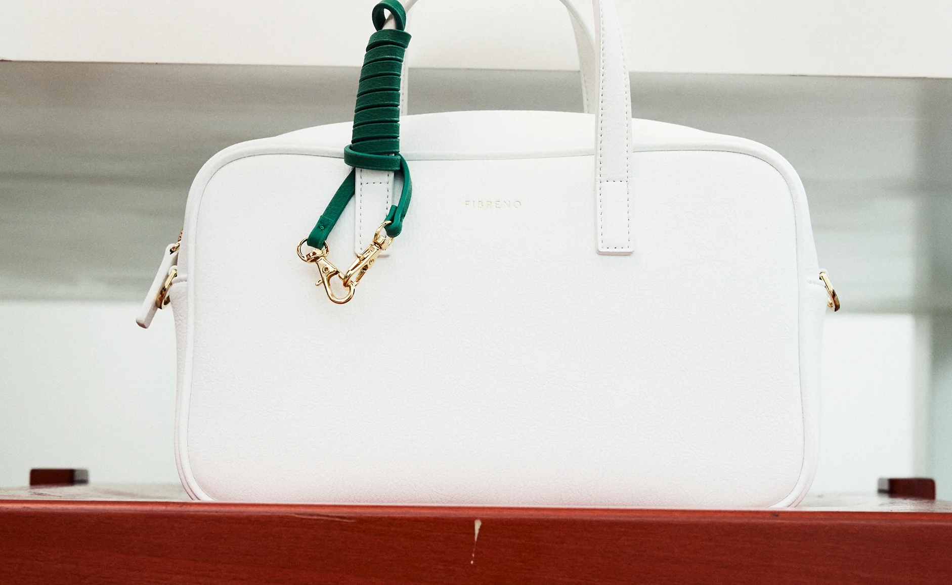
FIBRENO operates under the slogan “LIFE COLOR SHOP”, using color to deliver small wit and joyful imagination that bring vibrancy and positivity to everyday moments. To visually express the brand’s focus on daily delight and hope for tomorrow, Grid restructured its philosophy and built a visual system where each product becomes a medium of expression.
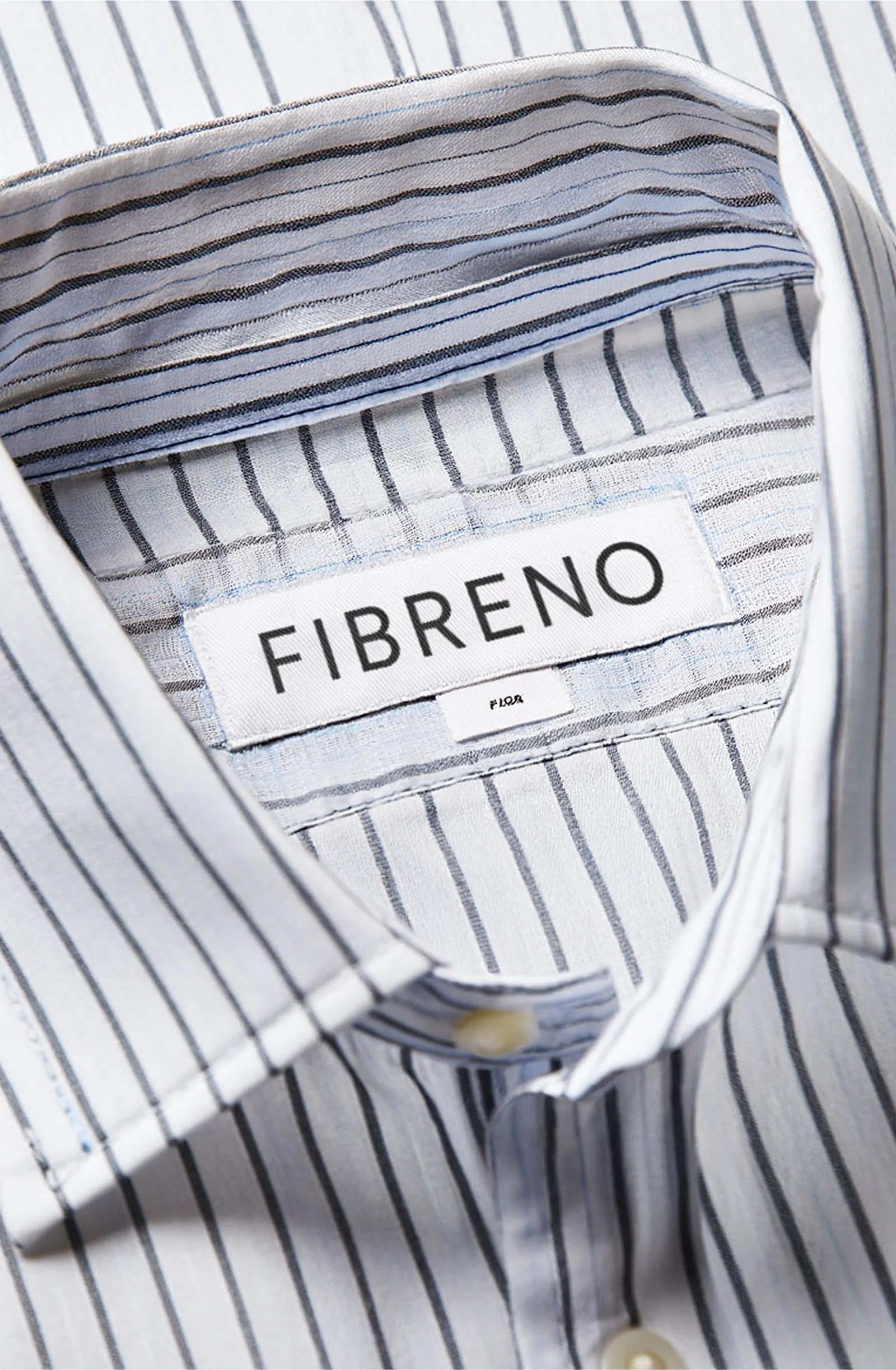
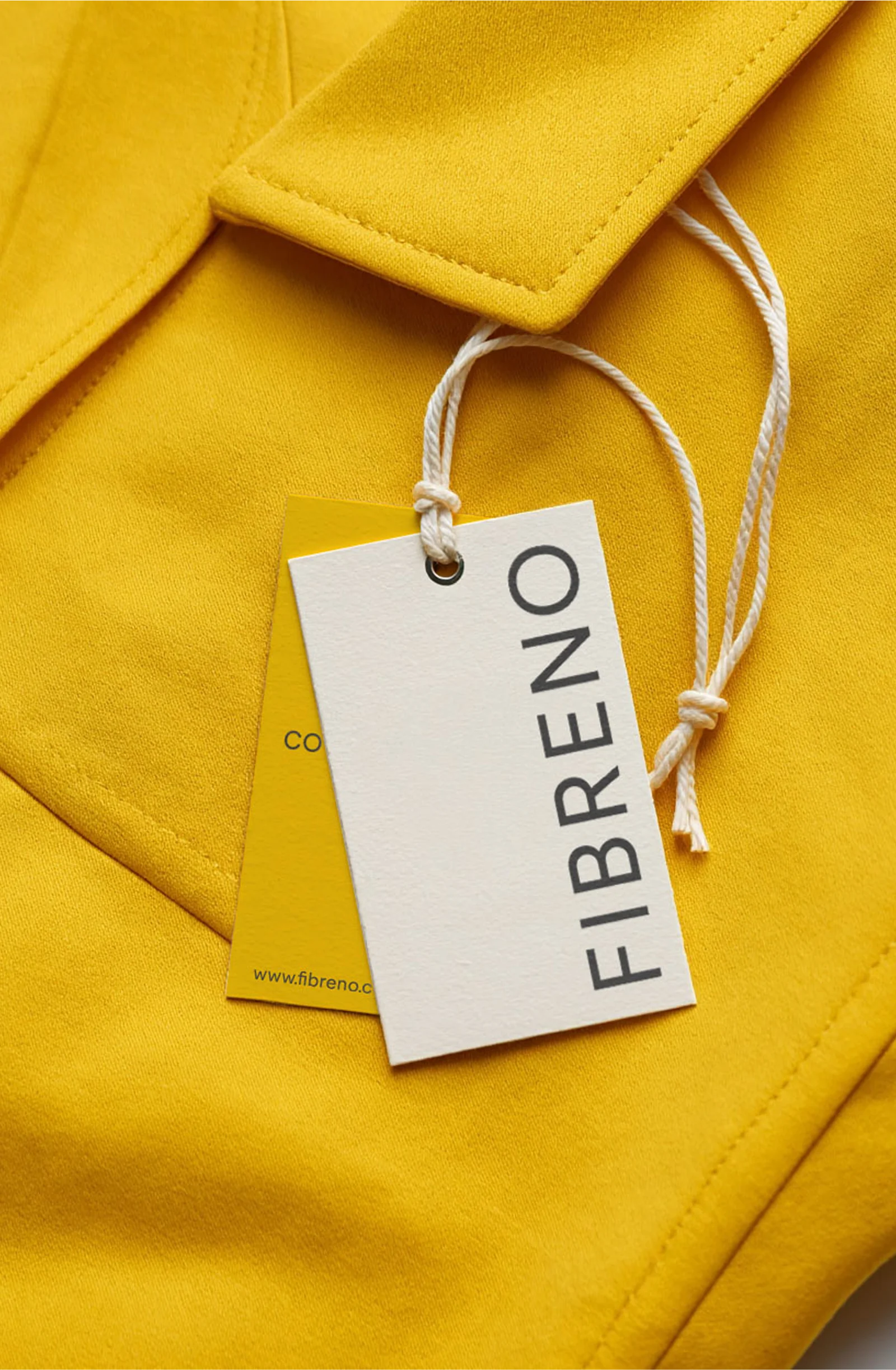
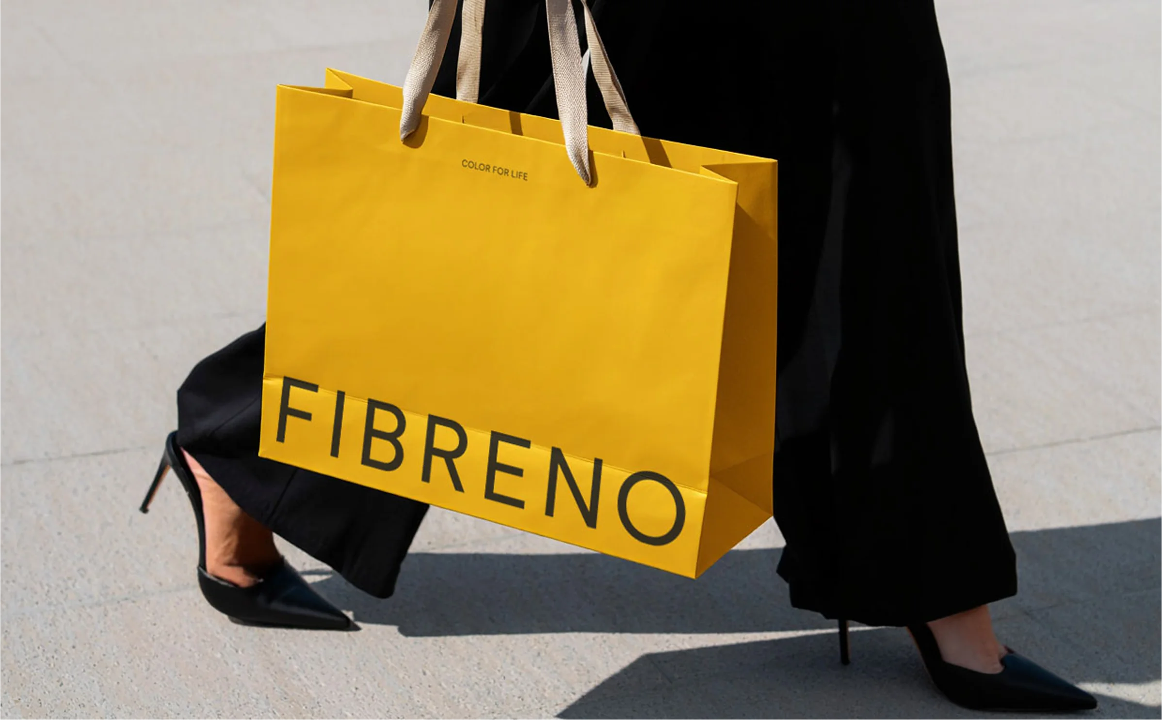
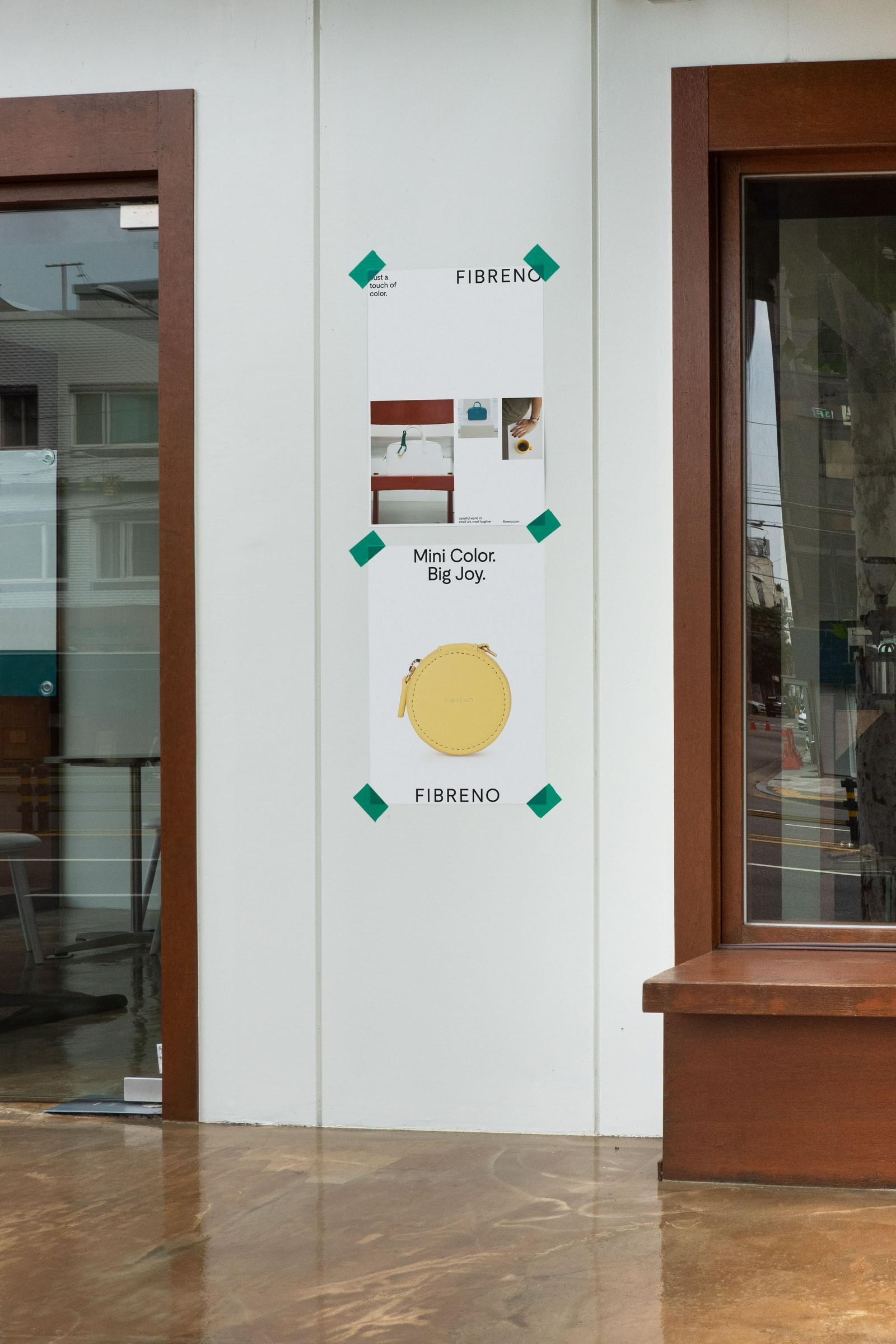
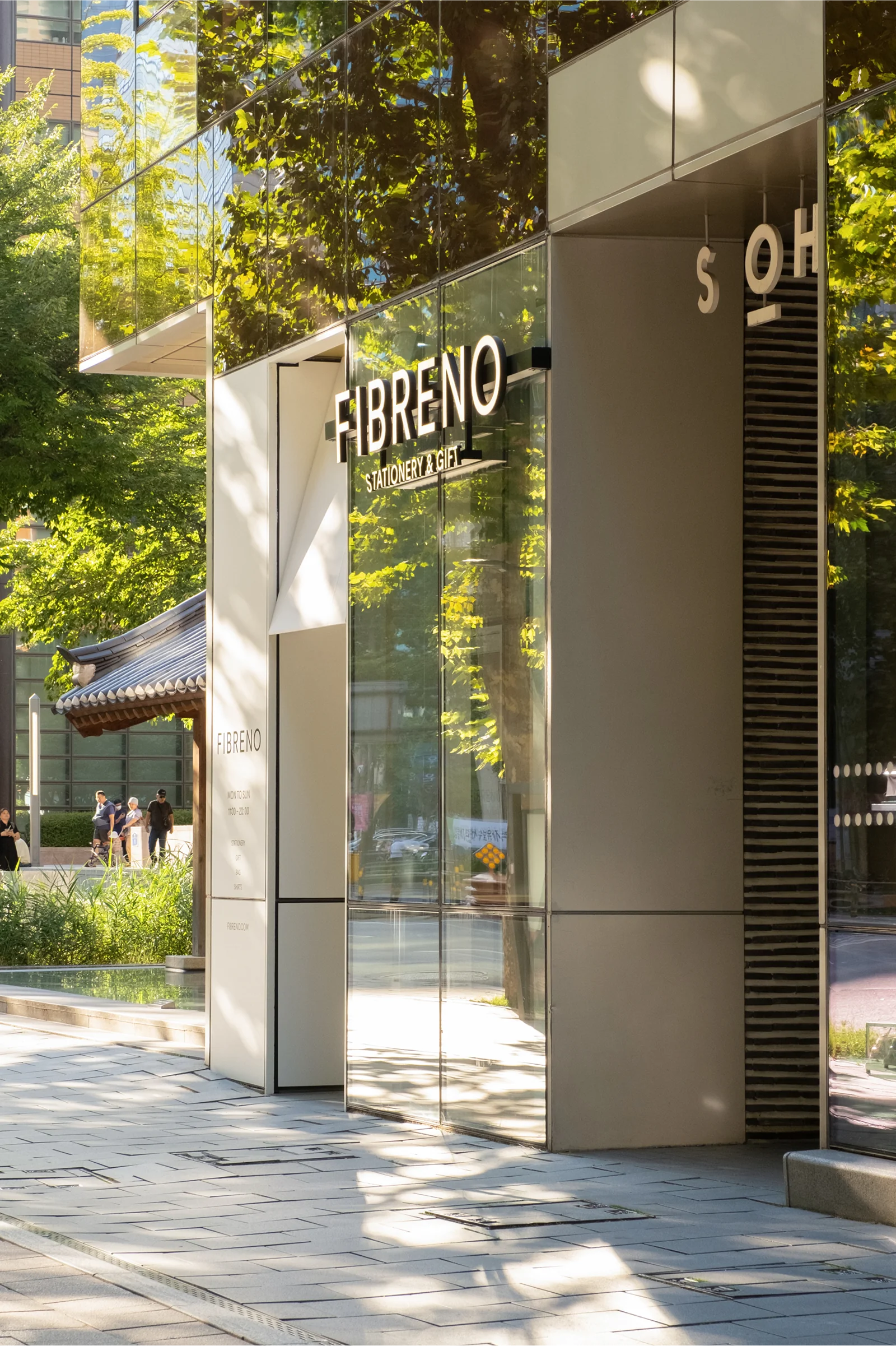
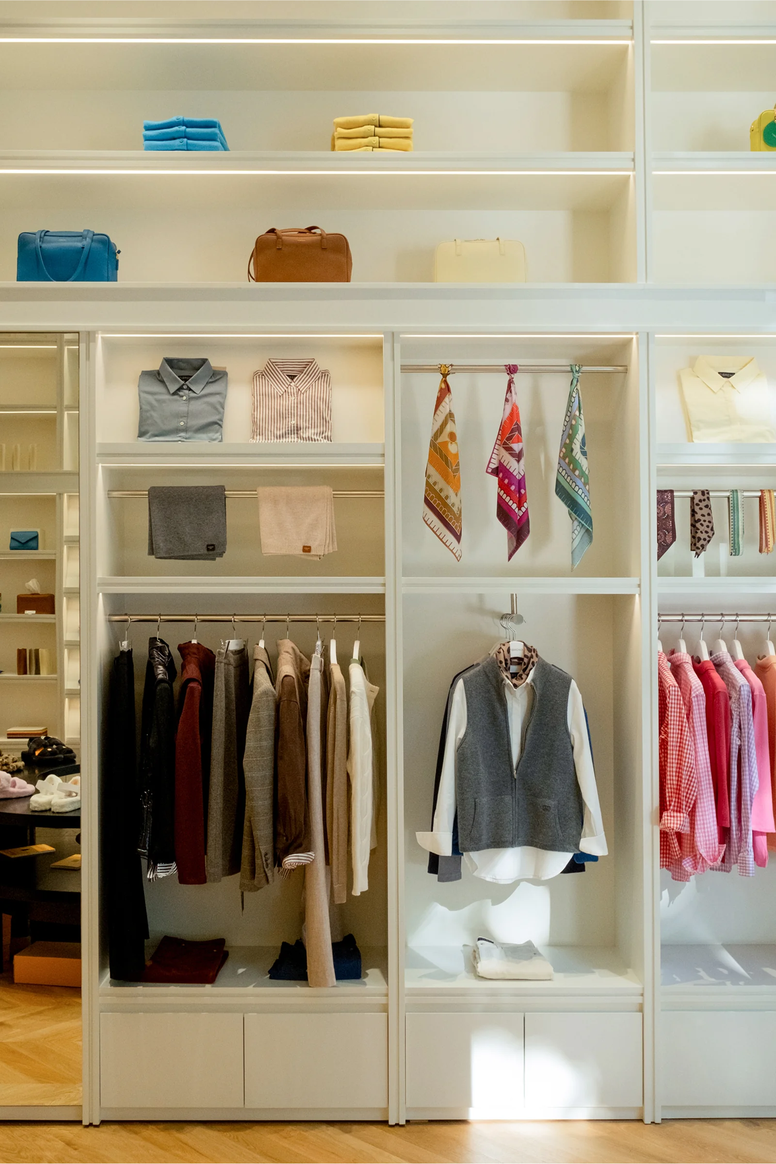
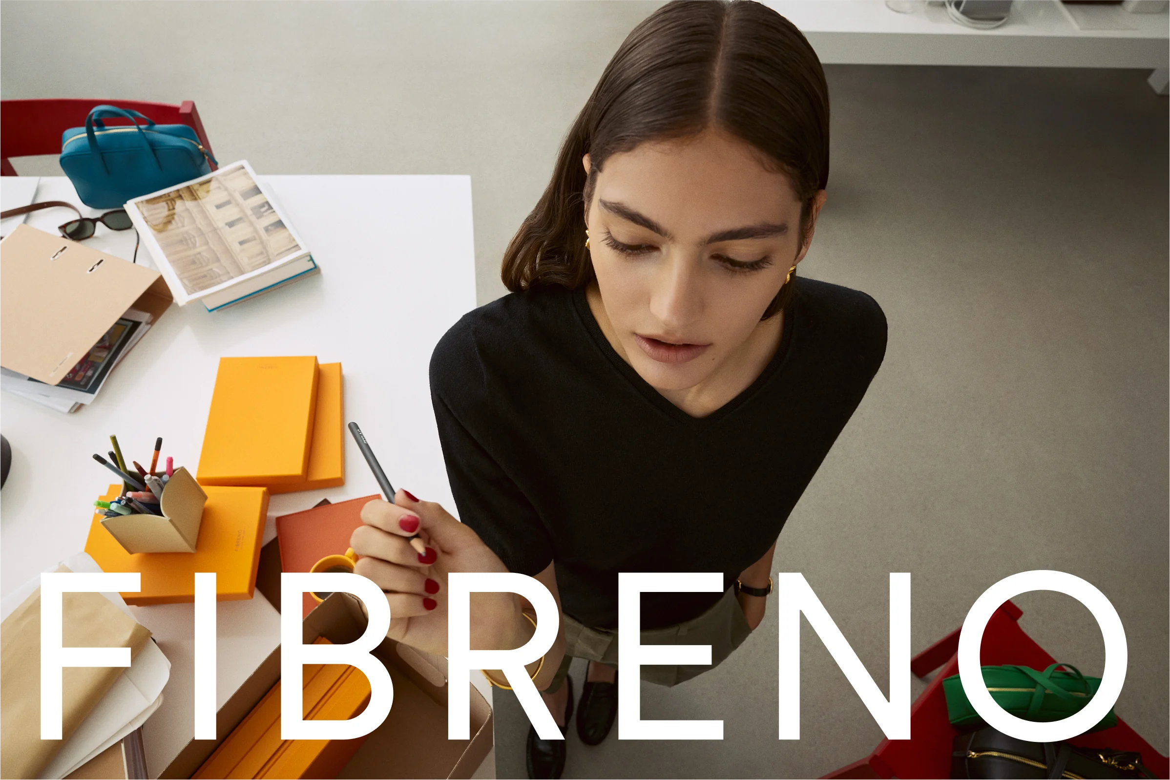
Grounded in FIBRENO’s minimal yet witty design language, Grid developed a typography system that reflects the brand’s structural sensibility and color-driven thinking. From tags and packaging to printed matter and social content, we built a coherent system across all touchpoints. We also designed a lifestyle-focused photography framework to highlight the brand’s colorful identity with clarity and depth.
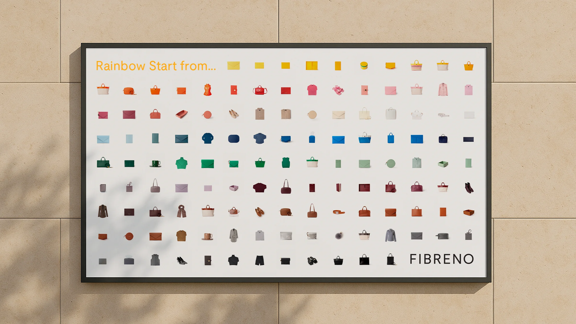
At the heart of this project was building a refined system that channels FIBRENO’s visual energy while creating a seamless link between its philosophy and user experience. FIBRENO’s color language — rooted in both emotion and utility — now operates fluidly across different platforms, conveying the brand’s values of optimism, everyday beauty, and personal expression.