12.2.1
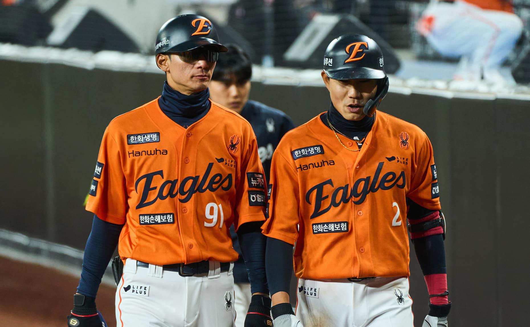
Hanwha Eagles in the new team uniform
Hanwha Eagles in the new team uniform
Hanwha Eagles is one of the most historic teams in the KBO League with a strong legacy of winning the league championship in 1999. Known for their bold eagle symbol and iconic orange color, the team has built a strong and loyal fanbase that stands firm regardless of wins or losses. However, over time, their eagle symbol—while still beloved—had been used across various touchpoints in inconsistent ways, leading to a diluted brand image.
Despite this, the team's unique identity remained a powerful asset. To preserve what fans already loved while addressing these inconsistencies, we looked into 1,000 fans, 300 designers, 10 industry experts, and players participated, alongside 11 in-depth interviews.
The key insight we uncovered was that the solution should be rooted not in "change," but in "refinement." A complete overhaul of everything would risk alienating both fans and internal stakeholders. Instead, we chose to sharpen what already worked and find our way around the areas that were becoming vague.
한화이글스는 40년간 KBO에서 긴 역사를 지닌 유서 깊은 구단으로, 99년도에 한국 시리즈 우승과 더불어 강인한 독수리의 상징을 지금까지 유지해 왔습니다. 승패에 좌우되지 않는 견고한 팬 커뮤니티와 독보적인 주황색 상징성으로 높은 인기를 보유하고 있지만, 시간이 지날수록 ‘독수리’의 이미지가 다양한 터치포인트에서 소비되며 일관된 브랜드 이미지가 퇴색되고 있었습니다.
그럼에도 불구하고 많은 사랑을 받는 고유한 팀의 정체성을 유지하면서 이러한 문제점들을 탈피할 수 있는 방향성을 모색했고, 그 해답은 1,000명의 팬, 300명의 디자이너, 10명의 전문가, 선수단 등의 조사와 더불어 11번의 심층 인터뷰로 발견할 수 있었습니다.
Grid가 발견한 전략의 핵심은 '변화'가 아닌 '계승'에 있었습니다. 이미 많은 사랑을 받고 있는 구단의 뿌리를 흔드는 리브랜딩은 내부 구성원은 물론 팬들에게도 환영받기 어렵다 판단했습니다. 한화이글스가 이미 지닌 강점을 더욱 정교하게 다듬고, 부족한 부분을 보완하는 것이야말로 필요한 방향이었습니다.
Field research insights review session
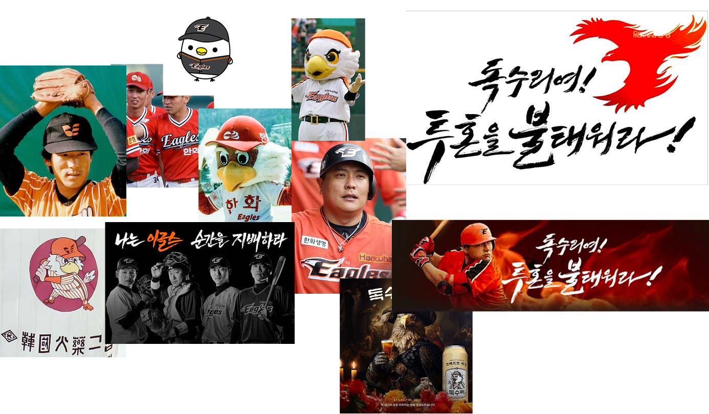
40 years of 'Eagleness'
Through this process, GRID uncovered a single, unshakable core: Hanwha Eagles was always linked tightly with the ‘eagle spirit.’ From the beginning, the team had embodied the spirit of an eagle soaring toward the sun—an identity that had remained deeply rooted across four decades of brand evolution. The eagle, ever-ascending and resilient, was not just a symbol—but the very essence that Hanwha Eagles needed to preserve.
이 과정에서 Grid는 하나의 중심축을 발견했습니다. 팬들과 프런트, 그리고 KBO 내 모든 관계자들은 한화이글스를 ‘독수리’와 본능적으로 연결짓고 있었던 것입니다. 한화이글스는 40년간 태양을 향해 웅비하는 독수리의 정체성을 계승해 왔으며, 이는 브랜드 아이덴티티의 모든 단계에 깊게 뿌리내려 있었습니다. 더 높은 곳을 바라보며 힘차게 나아가는 독수리야말로 한화이글스가 계승해야 할 정체성이였습니다.
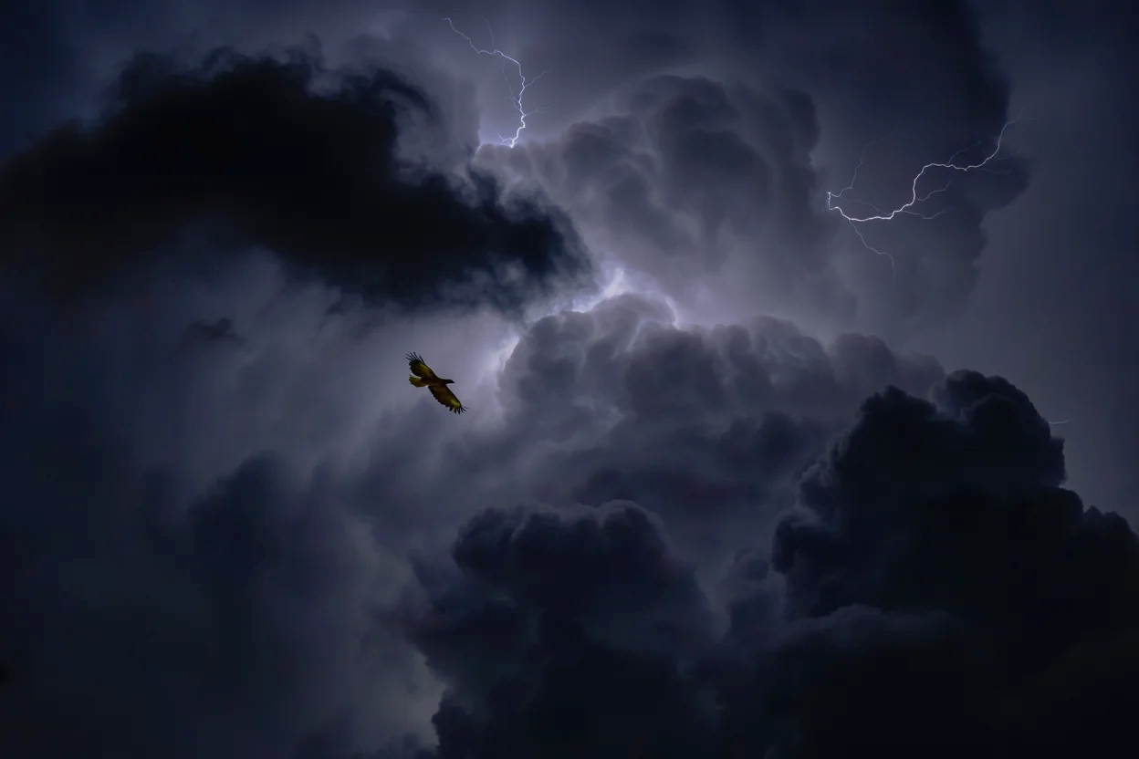
Eagles, Ride the Storm
This renewed definition of the ‘eagle spirit’ was drawn from the team’s strongest asset. Across interviews with fans, players, and office staff, the word ‘perserverence’ stood out. The strongest trait of Hanwha Eagles they envisioned was being quiet yet unyielding—a team that stands tall through hardship and rises again, no matter the setback.
From this insight, the eagle was reimagined as a symbol of their defiance, soaring even higher in the face of the storm. This led to the creation of the brand slogan “RIDE THE STORM”—a powerful expression of the team's enduring spirit and a unifying concept that would carry through every season, on and off the field.
한화이글스의 미래까지 함께할 ‘독수리’에 대한 정의는 한화이글스의 근본적인 정신에서 출발했습니다. 팬, 선수, 프론트 모두가 바라보는 한화이글스의 정신이란 ‘묵묵함'이였습니다. 어떤 고난과 역경이 와도, 이에 굴복하지 않고 다시 일어나는 끈질김이야말로 한화이글스의 정체성이라고 인식했습니다. Grid는 ‘묵묵하게 나아가는' 독수리를, 거센 바람과 흐린 먹구름 속에서도, 항상 다시 상승하며 태양을 향해 웅비할 힘을 지닌 상징으로 재해석했습니다.
이를 토대로 한화이글스의 ‘독수리'를 태풍이 휘몰아치는 환경에서도 더욱 높게 비상하는, 꺾일 수 없는 의지를 지닌 팀으로 브랜드 스토리를 재정립했습니다. 태풍의 진한 검푸른빛이 깃든, 눈부신 주황색 눈빛을 지닌 독수리의 상징으로 재해석했습니다. 해당 브랜드 스토리를 기반으로 ‘RIDE THE STORM’이란 브랜드 슬로건이 탄생했으며, 이는 야구 시즌이 바뀌어도 항상 한화이글스의 주축이 되는 핵심 정신력을 표현하는 상위 개념으로 자리잡았습니다. 한화이글스의 창립일부터 모든 과거, 현재, 그리고 앞으로 나아갈 미래를 담을 수 있는 그들만의 독수리를 단단한 브랜드 스토리로 정립했습니다.
BTS with MWD, Hanwha Eagles
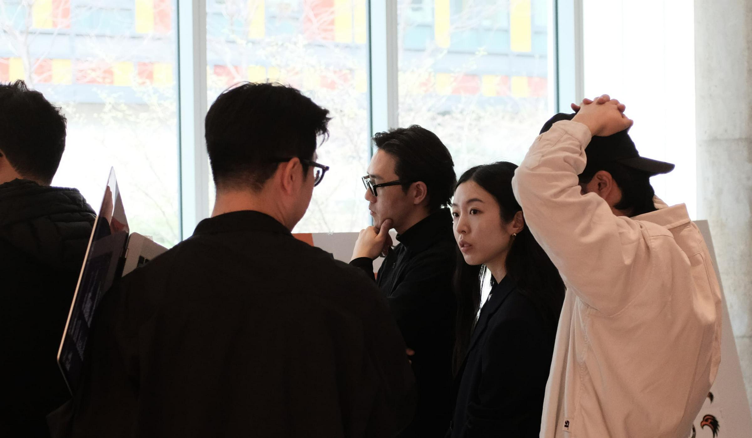
Building on this brand story and strategy, GRID collaborated closely with Matthew Wolff Design and the Hanwha Eagles team to define the team’s core brand assets and ensure they formed a cohesive identity system. Serving as a facilitator throughout the process, GRID led the creative direction and communication across all partners to maintain consistency from concept to execution.
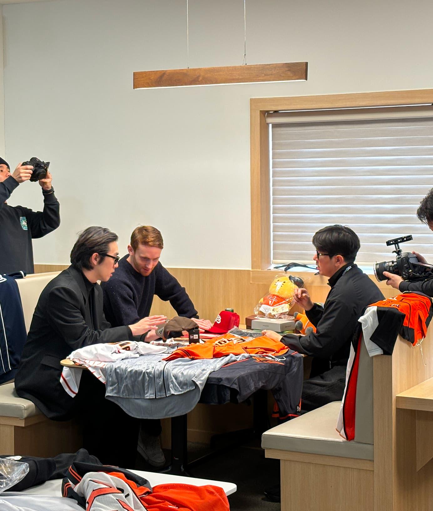
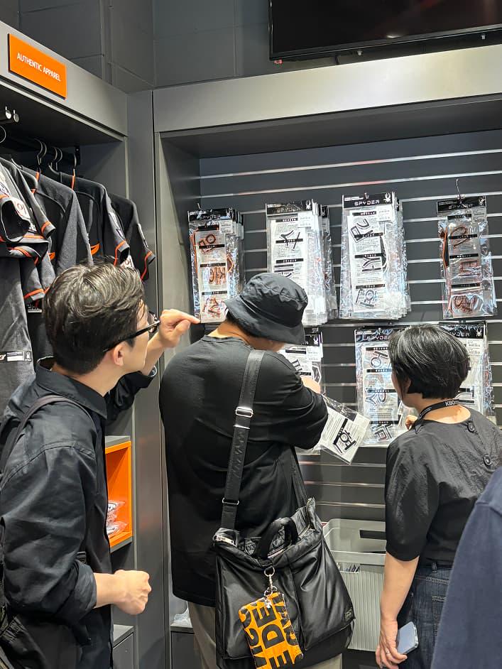
During implementation, GRID elevated the brand into a multidimensional identity—overseeing application design, localization, and the refinement of every asset for actual use. To find ground in its local roots, the team made multiple visits to Daejeon, gaining on-site insights. Simultaneously, GRID explored global benchmarks by visiting MLB operations in New York, gathering firsthand references on professional sports branding.
GRID worked alongside the team for the final touches such as uniforms to pictograms, signage, and the physical environment of Hanwha Life Eagles Park in Daejeon, ensuring every touchpoint reflected the new identity with precision and consistency.
해당 브랜드 스토리와 전략을 바탕으로, Grid는 Matthew Wolff Design 및 한화이글스 팀과 협업하여 핵심 브랜드 에셋을 도출하고, 이 모든 요소들이 하나의 일관된 아이덴티티로 연결될 수 있도록 리딩했습니다. 각 협력 파트너들이 같은 방향성을 가지고 결과물을 만들어낼 수 있도록 디렉팅과 커뮤니케이션을 주도했으며, 도출된 에셋들을 어플리케이션 디자인과 로컬라이징 등 다양한 접점으로 확장해 브랜드 아이덴티티를 완성했습니다.
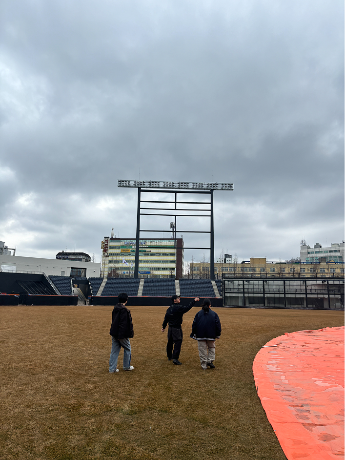
이 과정에서 Grid는 팀의 연고지인 대전을 여러 차례 방문해 지역에 대한 이해도를 높히고, 야구의 본고장인 뉴욕에서 글로벌 스포츠 브랜드 운영 방식에 대한 레퍼런스를 수집했습니다. 대전 한화생명 이글스파크, 유니폼, 브랜드 가이드라인, 픽토그램, 사이니지 등 실사용 결과물까지 모든 터치포인트가 하나의 브랜드로 통일되도록 테스트하고 조율하며, 프로젝트의 전 과정을 함께했습니다.
From insights to final results
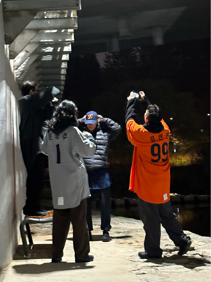
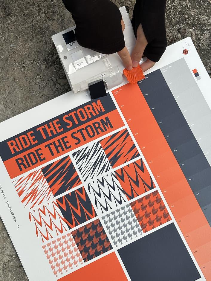
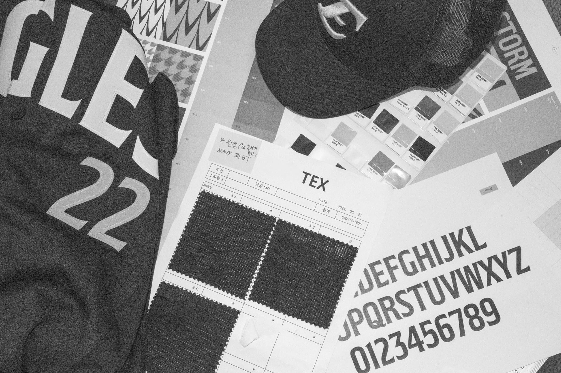
One of the most significant moments in the project was translating the brand identity from 2D graphics into the real world. This included multiple rounds of review and refinement—such as testing uniform textiles, evaluating color palettes, and simulating the practical use of pictograms—to ensure visual precision. The identity then extended into a full brand campaign and was brought to life during the opening game at the team’s newly renovated stadium, where it naturally blended into both the game-day environment and the surrounding community.
브랜드 아이덴티티가 2D 상의 그래픽을 넘어 현실 속으로 구현되는 과정은 프로젝트의 하이라이트였습니다. 유니폼 텍스타일 샘플링, 컬러 팔레트 테스트, 픽토그램의 실제 활용 시뮬레이션 등 수차례의 검토와 수정 과정을 거치며 정밀도를 높였습니다. 이후 브랜드 캠페인 촬영과 더불어 신구장 개막 경기에서의 현장 촬영까지, 한화이글스의 새로운 정체성이 실제 경기장과 커뮤니티에 자연스럽게 스며드는 모습을 입체적으로 담아냈습니다.
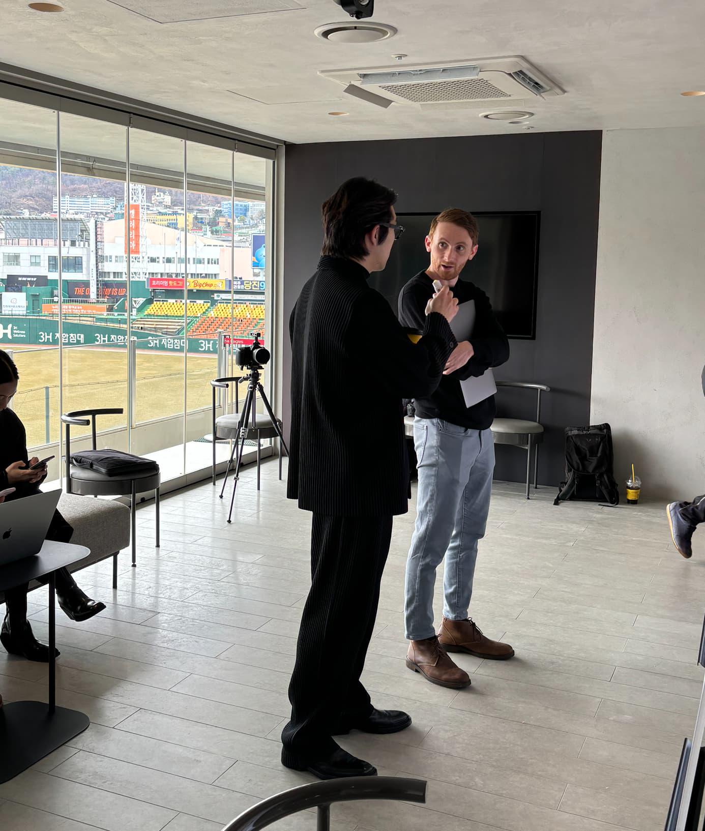
2nd Visual Workshop - New York City
Since the launch of Hanwha Eagles’ new brand identity, the team has seen record-breaking merchandise sales on a daily basis, while the rebranding itself is setting a new benchmark within the Korean professional sports industry. From in-depth research and insight to brand strategy, creative direction, and application design, every step was seamlessly connected—resulting in a brand that not only feels cohesive, but also deeply resonant. The project was never just a redesign; it was a thoughtful evolution, preserving the legacy and identity of the team while shaping a renewed spirit. Today, that spirit lives on—not only in the visual system, but in the hearts of players and fans alike, as they continue to rise one step closer to the sun.
한화이글스의 새로운 브랜드 아이덴티티가 세상에 공개된 이후, 현재 구단의 상품 매출은 매일 새로운 기록을 갱신하며 국내 프로스포츠 업계에 새로운 흐름을 만들어가고 있습니다. 깊은 리서치에서부터 시작해 인사이트 도출, 브랜드 전략 수립, 크리에이티브 디렉션, 그리고 어플리케이션 디자인까지 모든 부분이 일련의 과정으로 매끄럽게 연결되어 한화이글스만의 고유한 정체성을 계승했기에 공감대를 얻을 수 있었습니다. 단순한 ‘리디자인'으로 귀결된 프로젝트가 아닌, 브랜드의 역사와 정체성을 그대로 담은 한화이글스는 지금도 선수와 팬들에게 묵묵히 앞으로 나아가는 추진력을 불어넣어주고 있습니다.
All assets, all together.