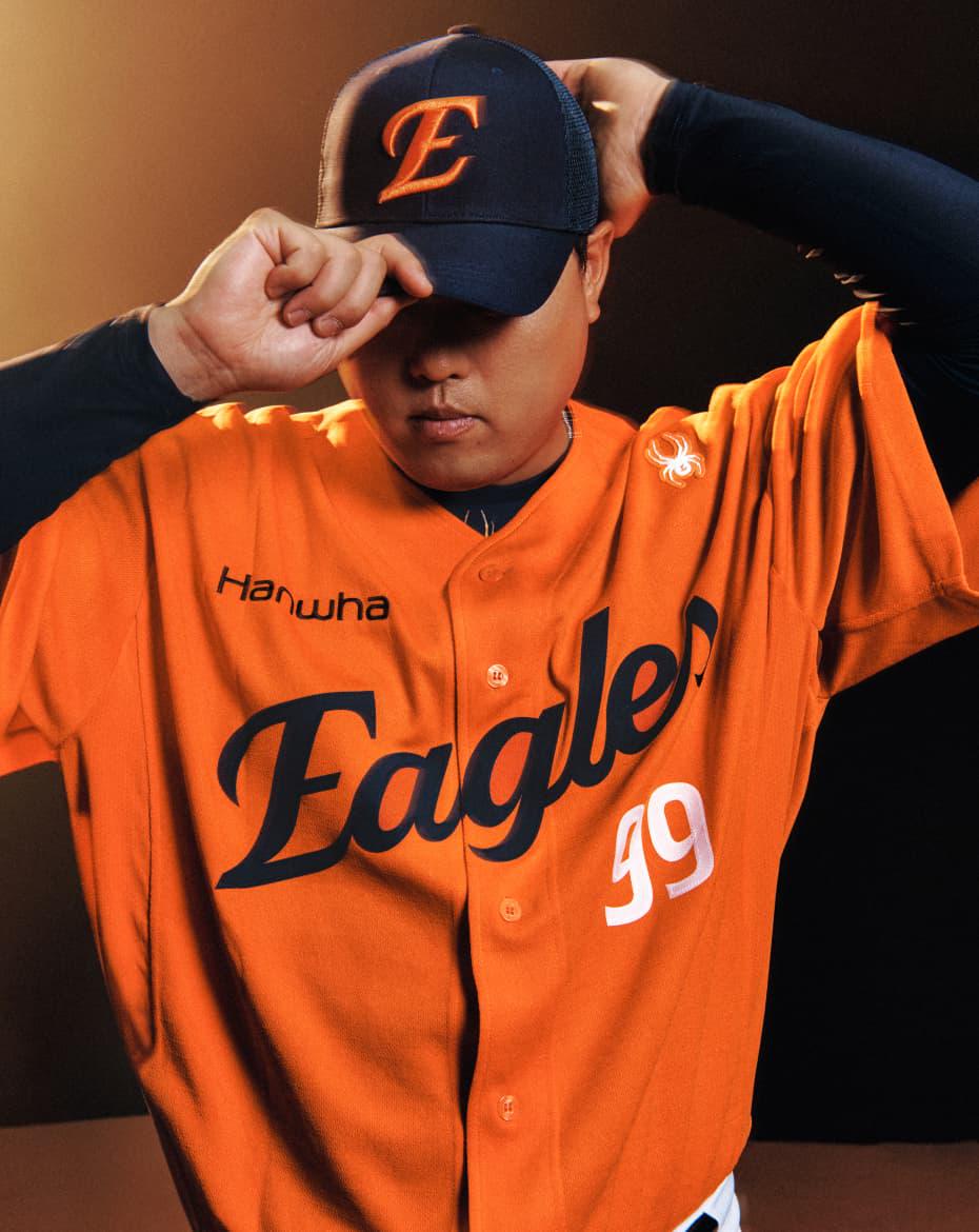
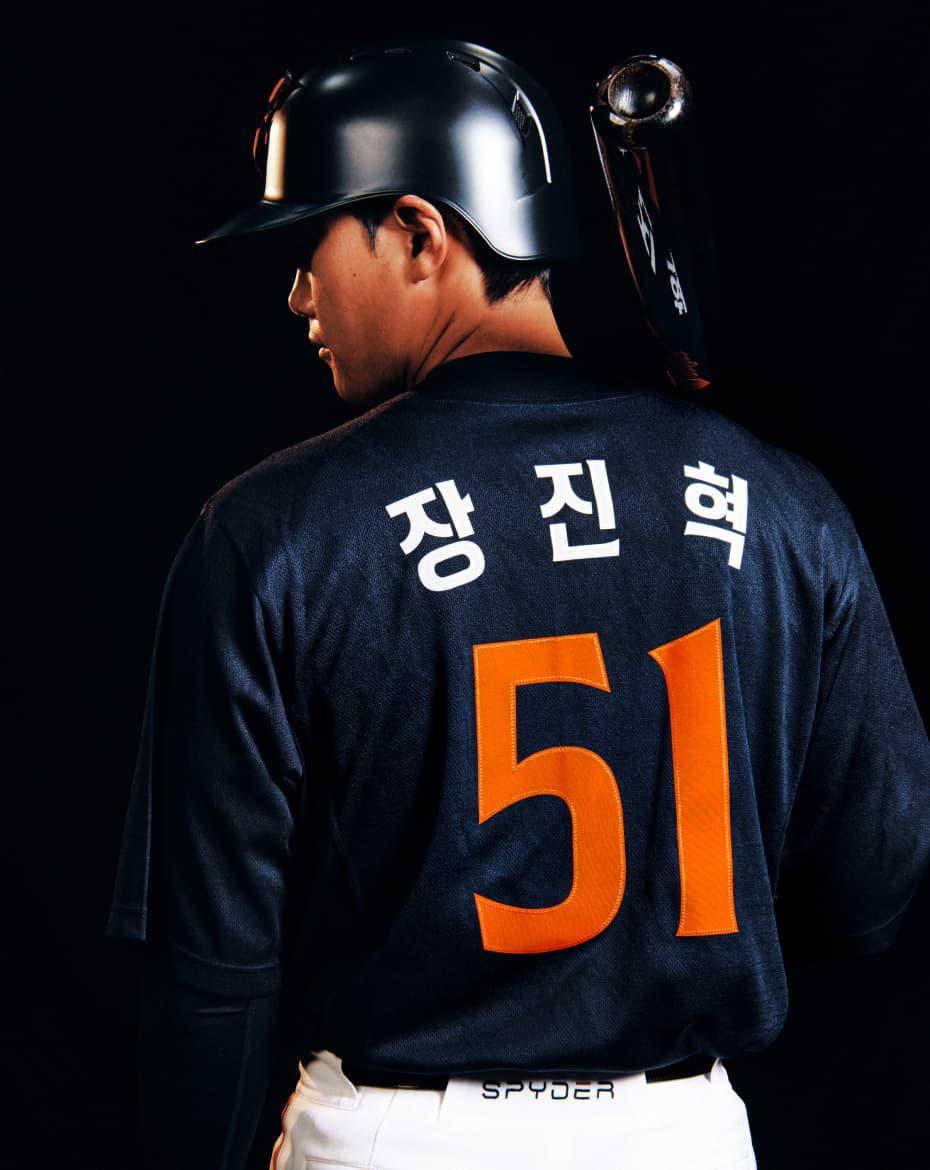
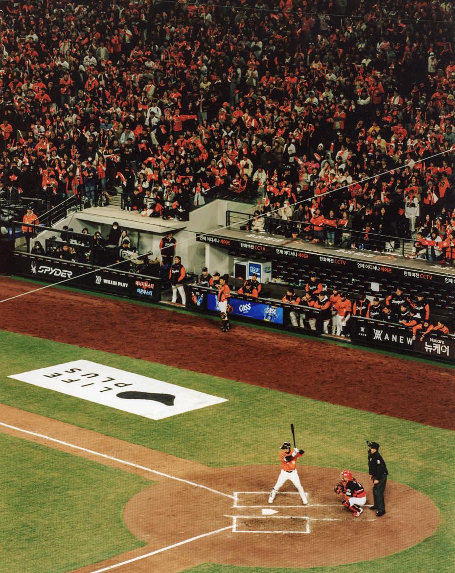
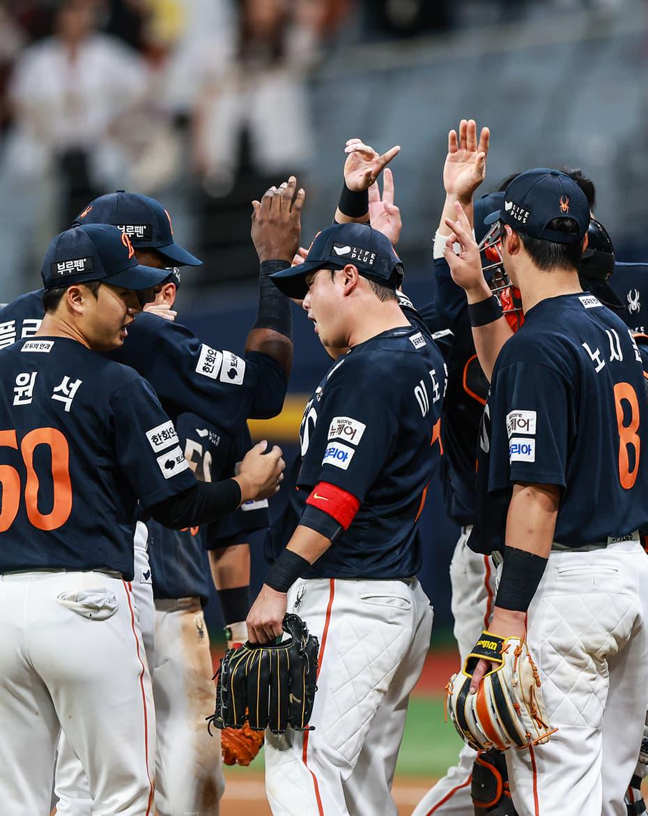
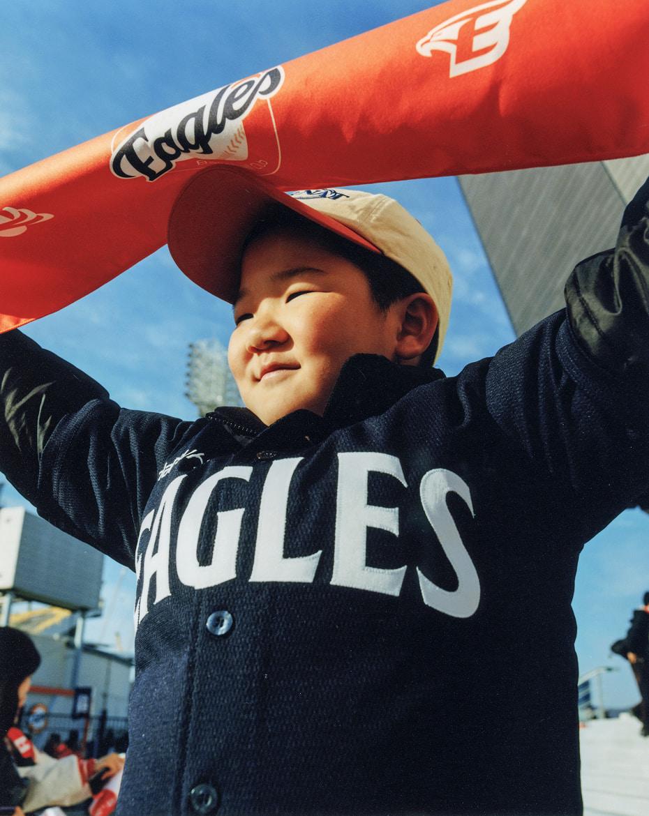
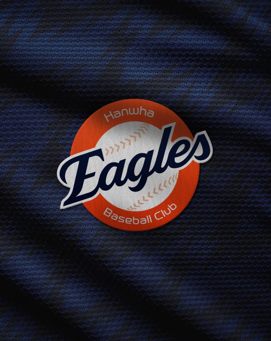
Hanwha Eagles, a South Korean professional baseball club, unveiled a renewed brand strategy, identity, and uniforms in celebration of its 40th anniversary in 2025. This project was the result of a 14-month collaboration between Hanwha Eagles, Matthew Wolff Design, and Grid. Grid played a key role in refining the rebranding strategy and visual elements, working across Daejeon, Seoul, and New York.
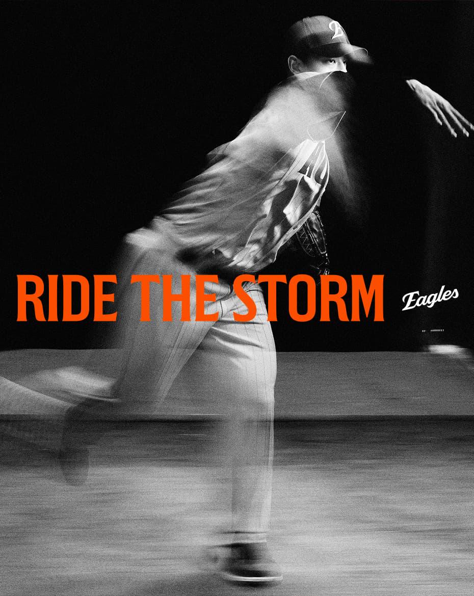
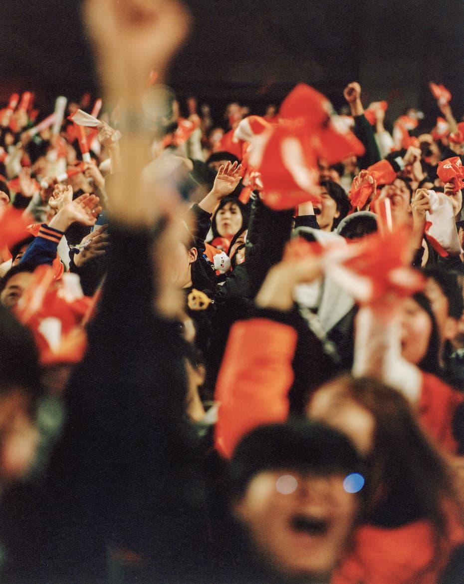
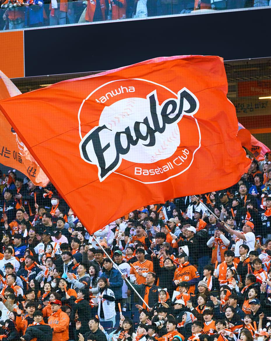
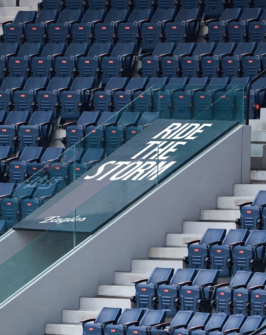
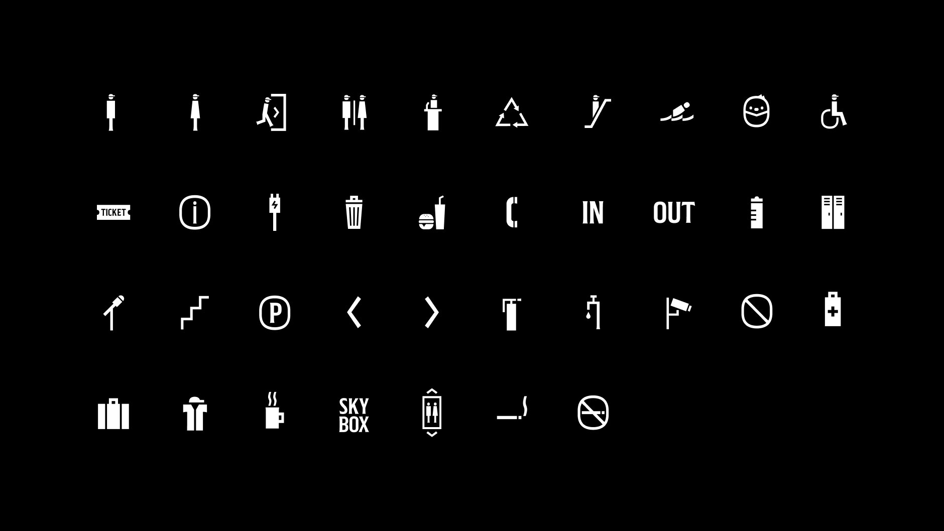
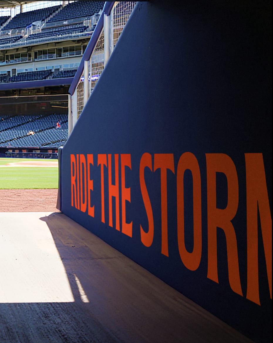
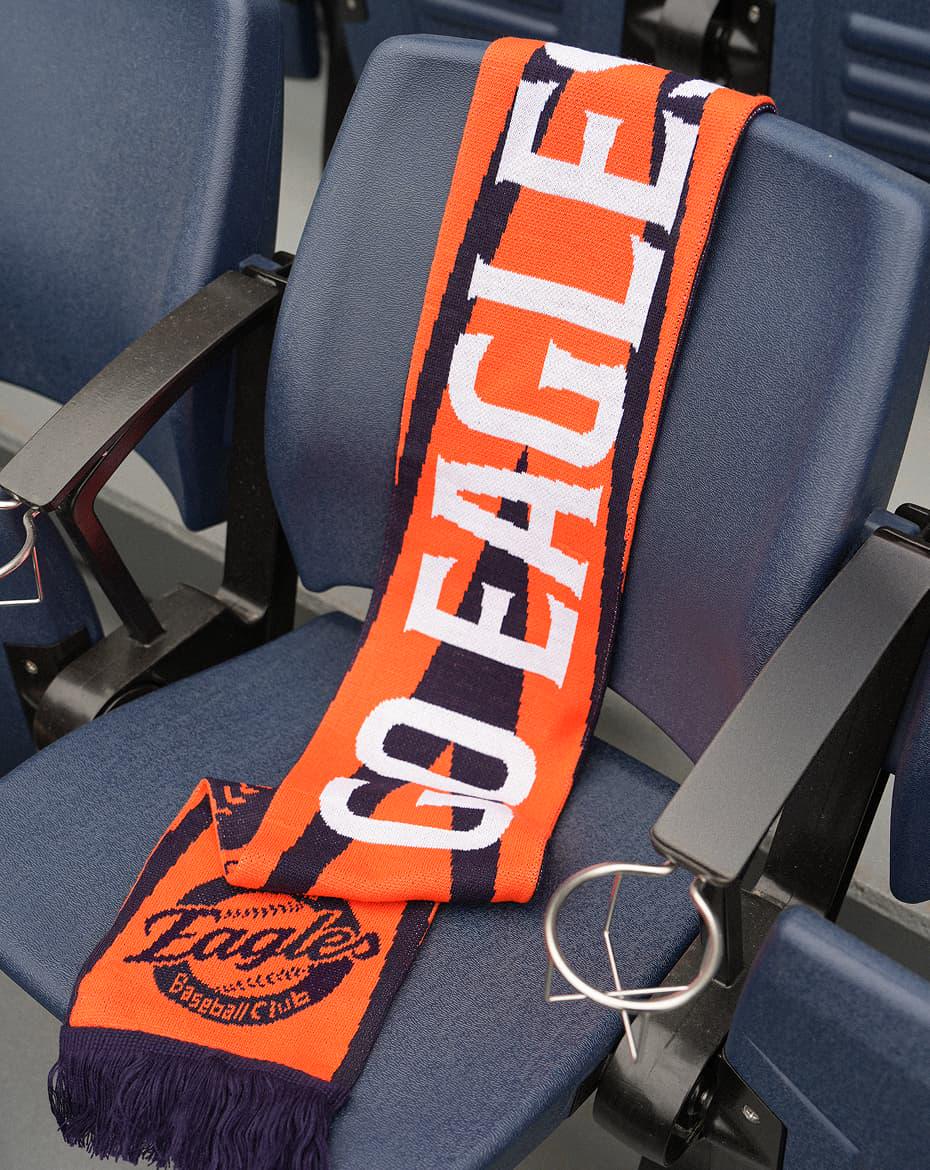
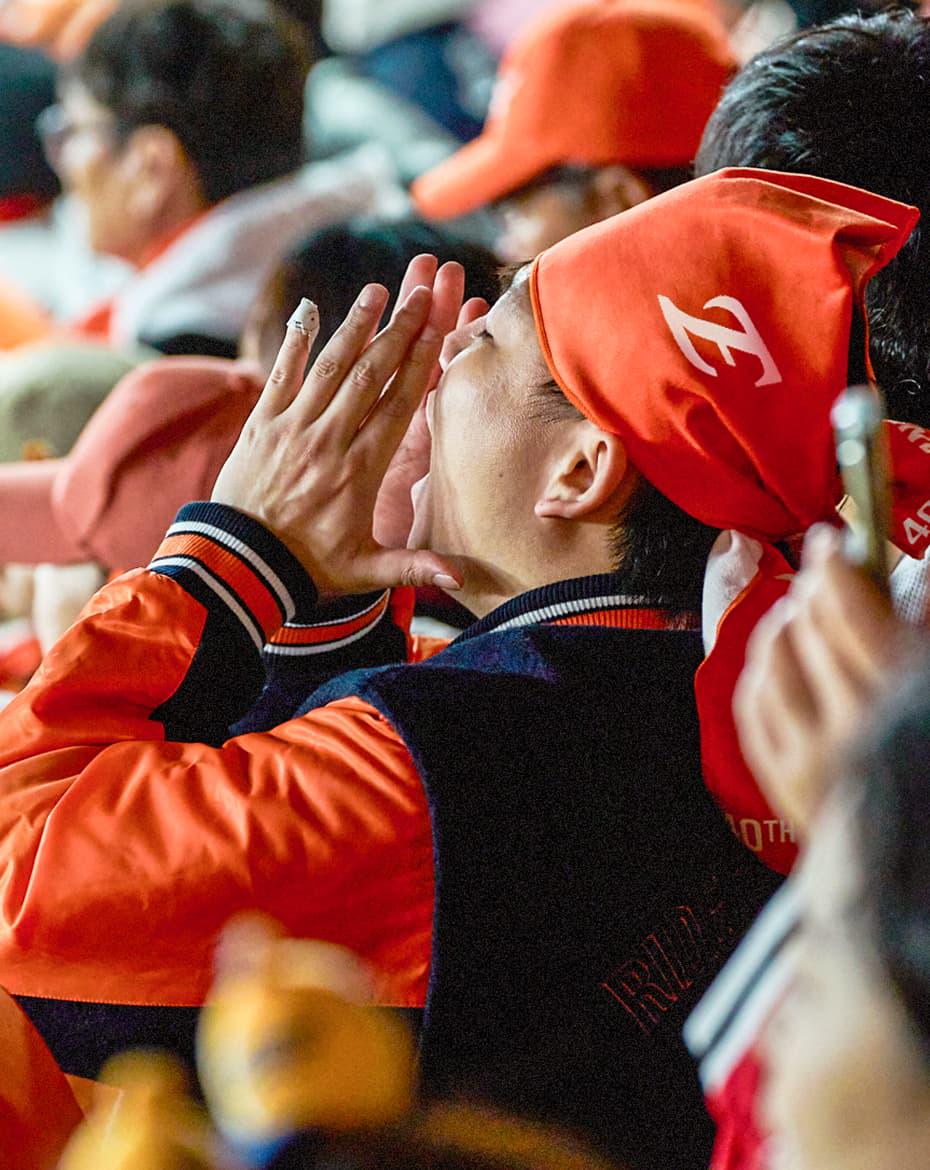
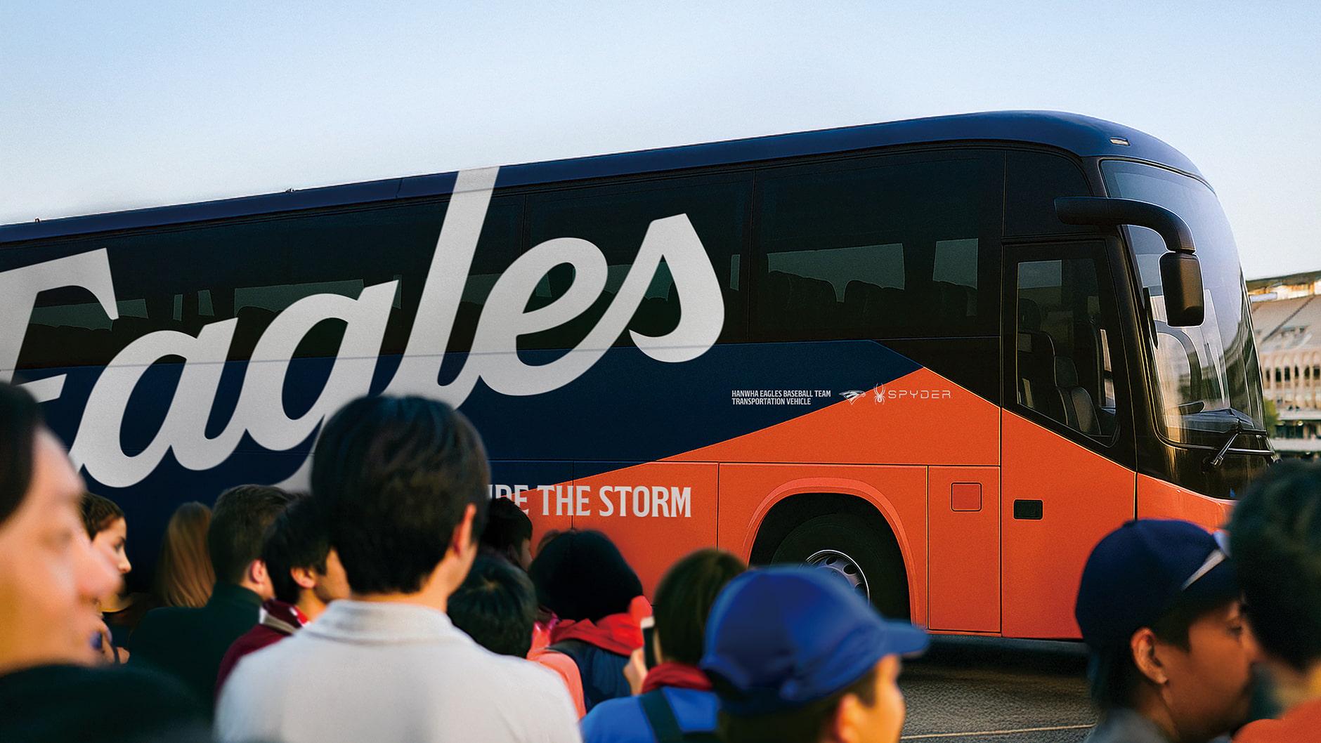
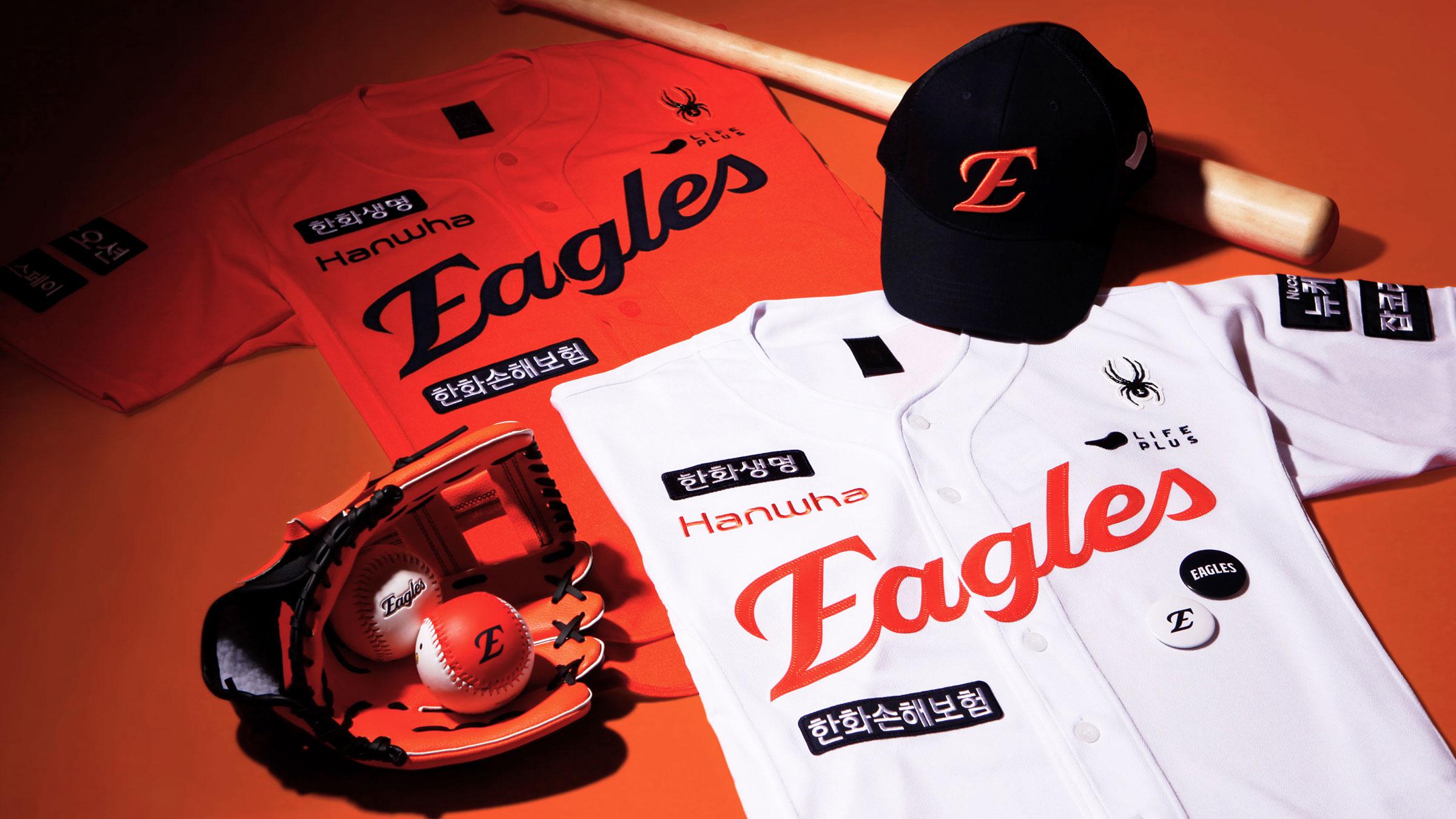
Known for its iconic orange and eagle symbol, the team had long struggled with a fragmented identity despite a loyal fanbase defined by resilience and pride. Fan research revealed that the eagle was more than a mascot—it was a symbol of perseverance. This insight led to a new brand concept: “RIDE THE STORM,” capturing the spirit of enduring adversity. The redesigned logo modernizes the Korean Series-winning emblem, while new visual assets—including feather motifs, custom typefaces (Korean and English), and a unified pictogram system—establish a cohesive identity across digital and physical touchpoints. Rooted in legacy but built for the future, the new identity gives Hanwha Eagles a bold, authentic voice.